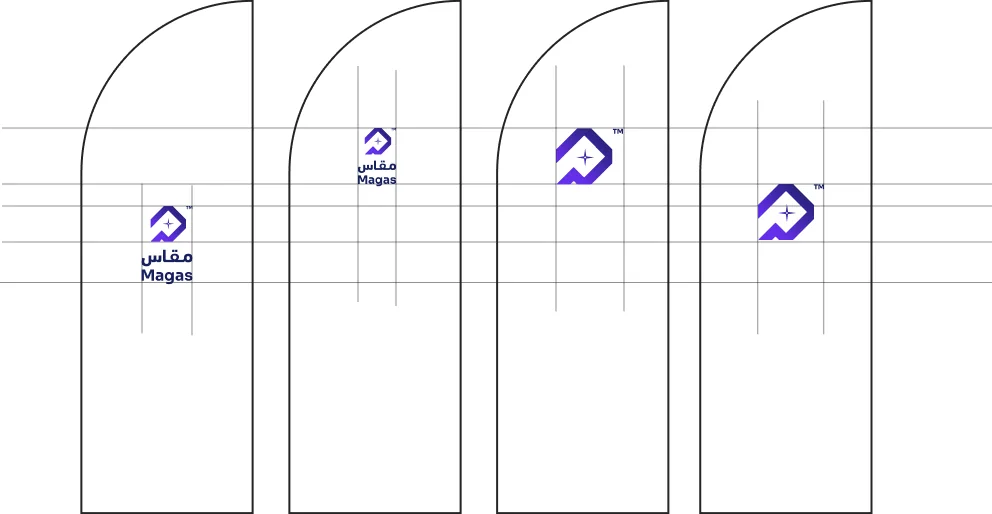




 Do not squeeze out the logo
Chapter 04
Brand Logo
Scroll
Brand Mindmap
Hover a branch
Feelings Mindmap
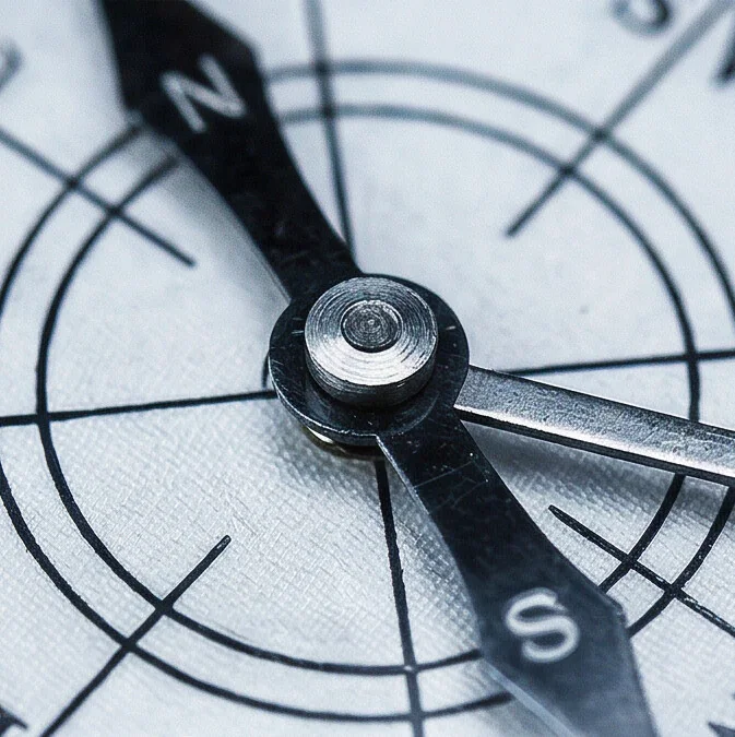
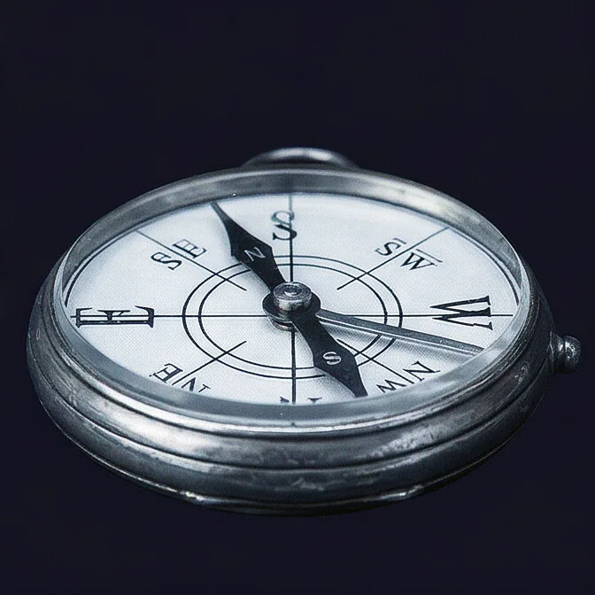
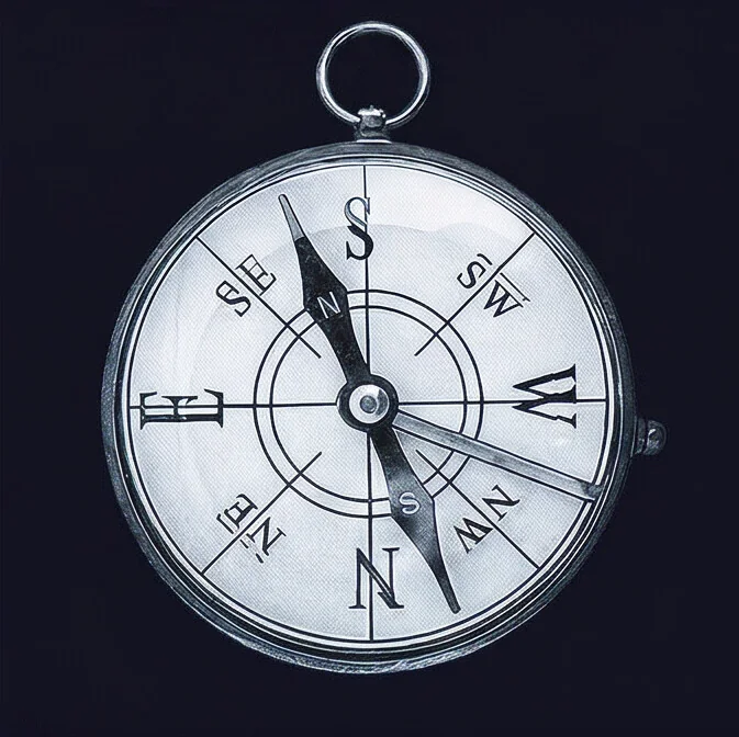
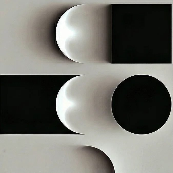
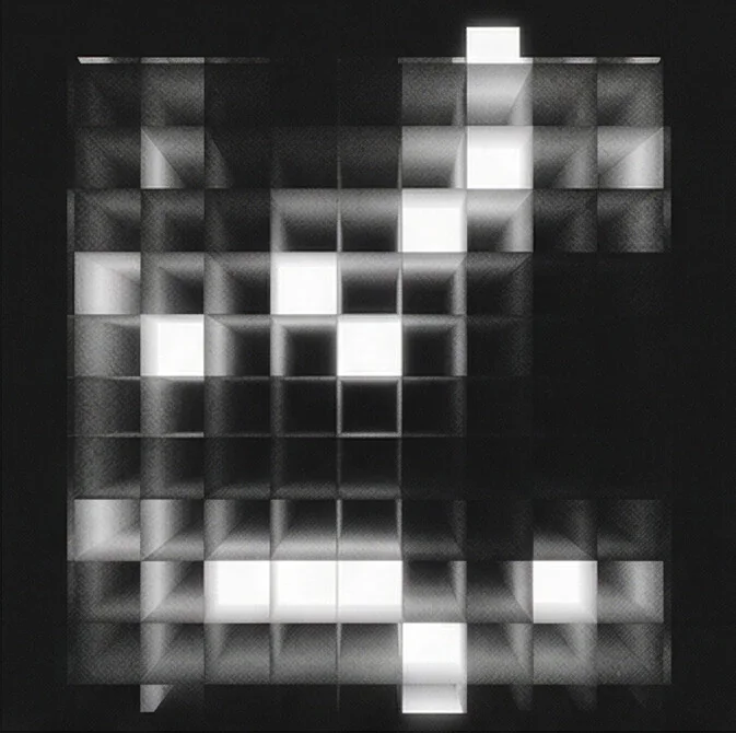
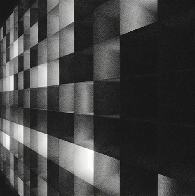
A Moodboard is not just a collage of visuals — it’s a strategic tool that translates abstract brand thinking into a tangible emotional direction.
Think of it as the bridge between strategy and design.
Logo Moodboard
Pick a cluster · click an image to enlarge
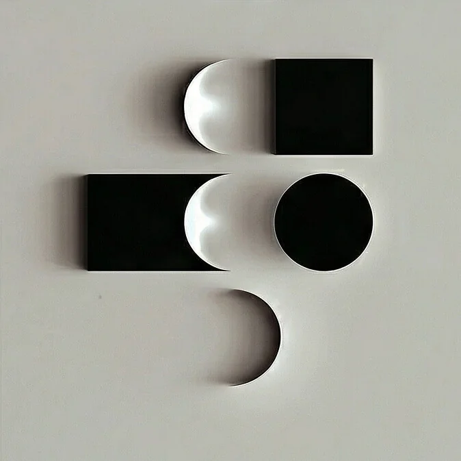
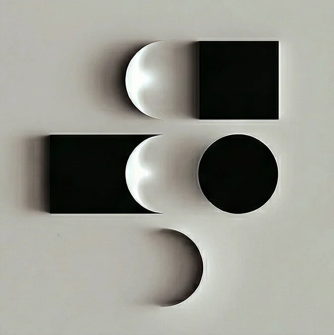
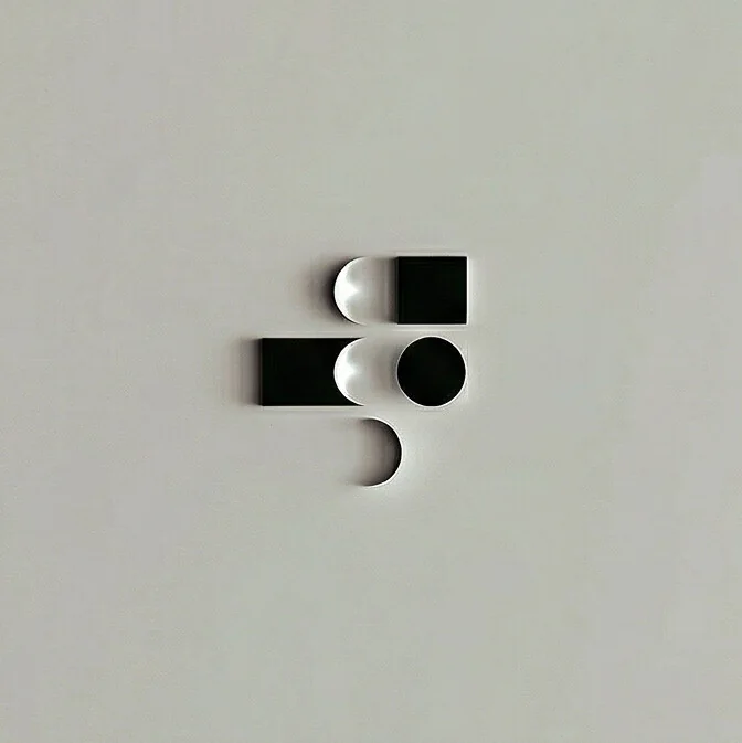
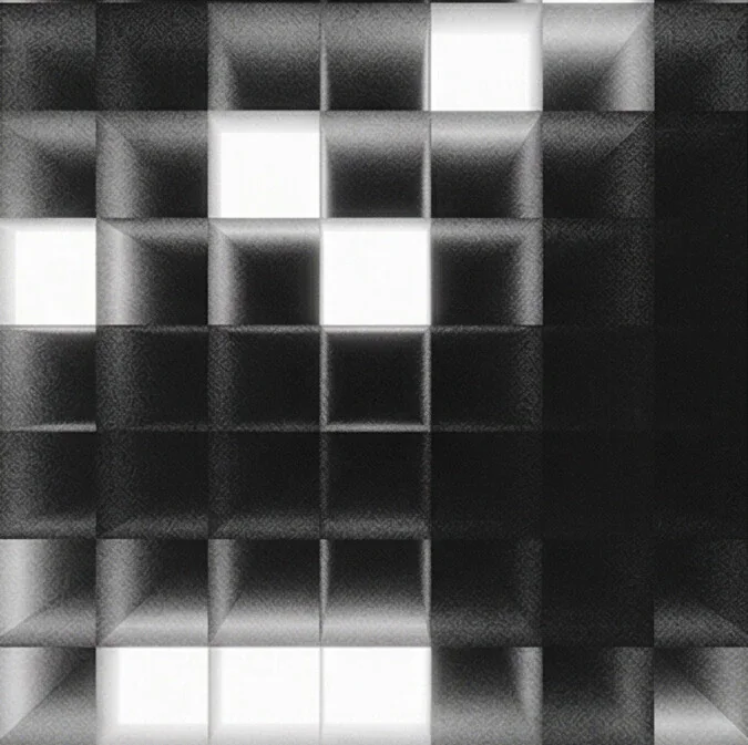
Low Fid
Sketching Phase
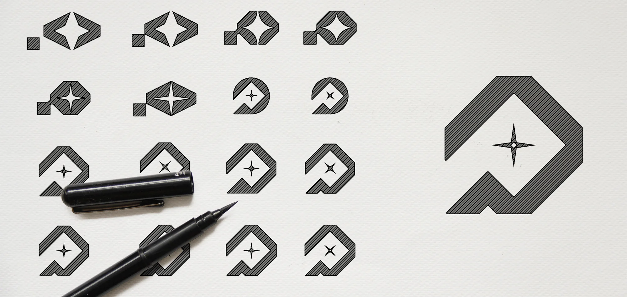
At this stage, we began designing the logo on paper through a series of hand sketches, directly guided by the mind map and moodboard.
Through this process, the ideas were gradually refined and developed until we reached the final design.
In front of you is a selection of these sketches, illustrating how the concept evolved in a structured way into a strong logo that reflects the brand’s essence with precision.
Logo Structure
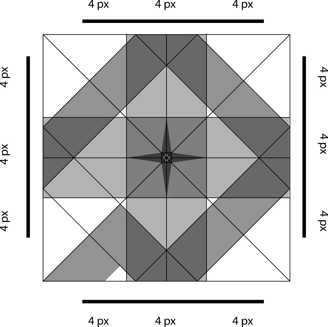
Logo structure is the internal architecture of a logo — how its elements are built, aligned, and related to each other to create a cohesive, scalable, and meaningful mark.
Layers
Build
Logo
A brand logo is not just a visual mark — it’s the most condensed expression of a brand’s meaning. It’s the point where strategy, perception, and recognition meet in a single form.
Logo files (SVG)
Logo Textures
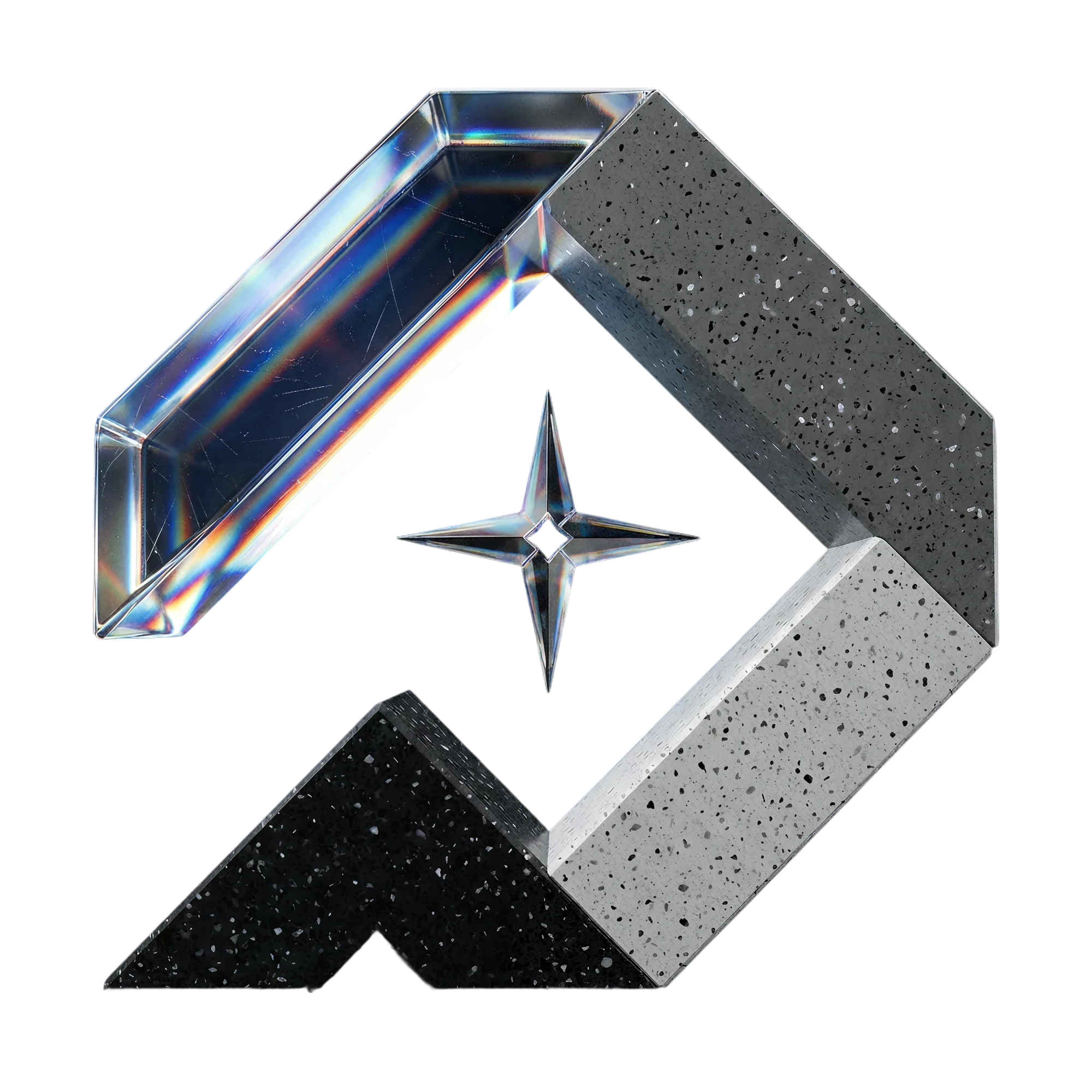
We derived visual textures from the brand to be used as supporting elements that reflect the brand’s spirit in the logo.
They can be used across ads, social media, the website, and print materials.
This shows the brand’s flexibility and ease of application across different channels.


Typeface Structure
The logo and typeface are built with precise proportions, and these proportions must not be altered under any circumstances.
Highlight
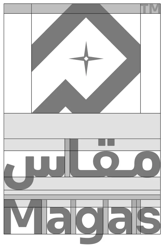
Move the pointer over the letters to reveal handles
Do not change spacing between the font
Logo Meaning
Hover a part of the logo, or read on
Logo on backgrounds

App Icon

3
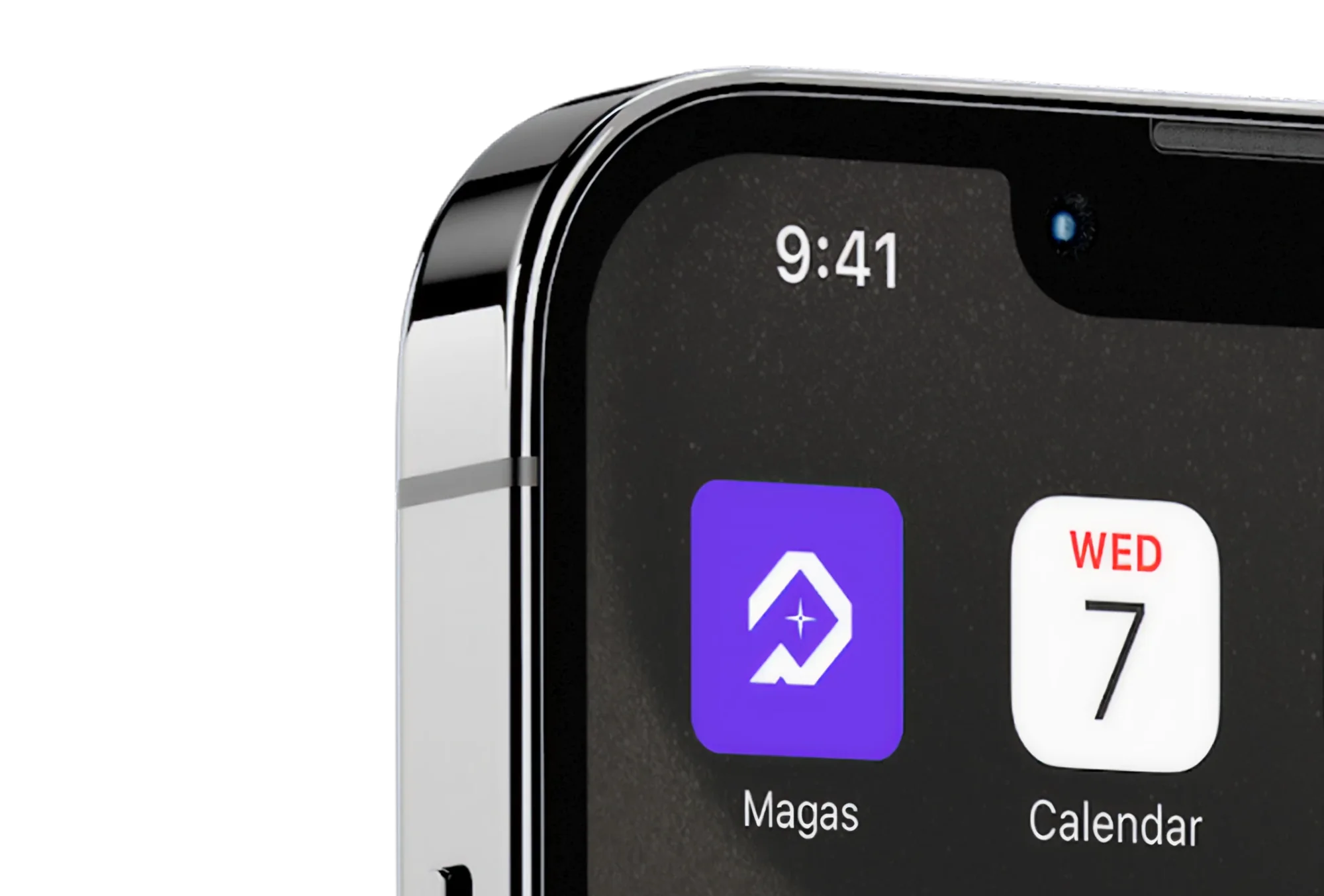
App Icon
As you can see, the logo is designed to work well for mobile applications, as it is simple and modern.
Logo on other Platforms
Click a button to copy its logo icon as SVG
Logo on Photography
Corner mark
Hover a photo to read its corner brightness.



Unacceptable to use
Do not change alignment
Do not use strokes
Do not change the typeface
Do not change spacing between the font
Do not add shadow to the logo
Click a card to compare the unacceptable example with the correct logo
Logo Sizes
Logo on Signs
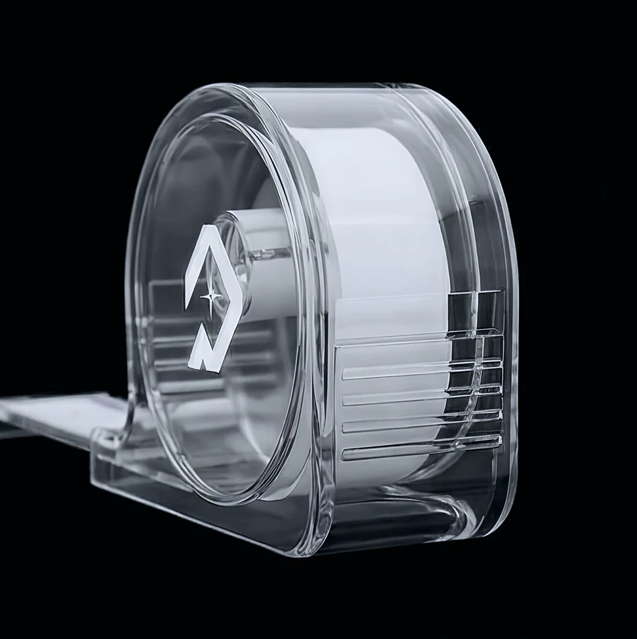
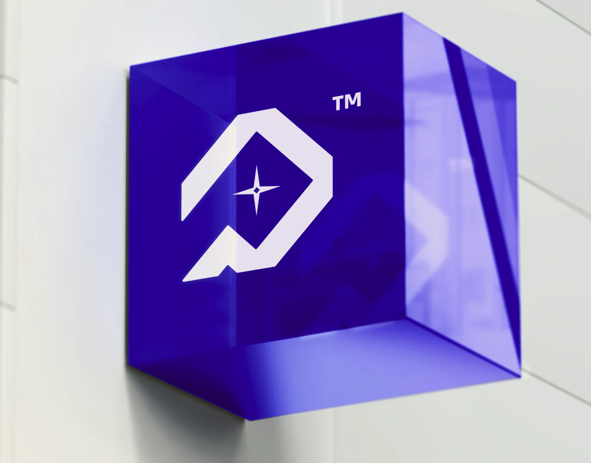
The signage on which the logo is displayed should be made of glass and feature a blue color, reflecting a sense of ease and flexibility, while also conveying modernity and intelligence.
Logo on Stationery
Letterheads
Logo placement on stationery is a critical part of brand consistency and professionalism. Here’s a quick guide to standard logo placements on common stationery items:
Pick a placement to preview it alone
Logo on Stationery
ID Cards
Logo placement on stationery is a critical part of brand consistency and professionalism. Here’s a quick guide to standard logo placements on common stationery items: