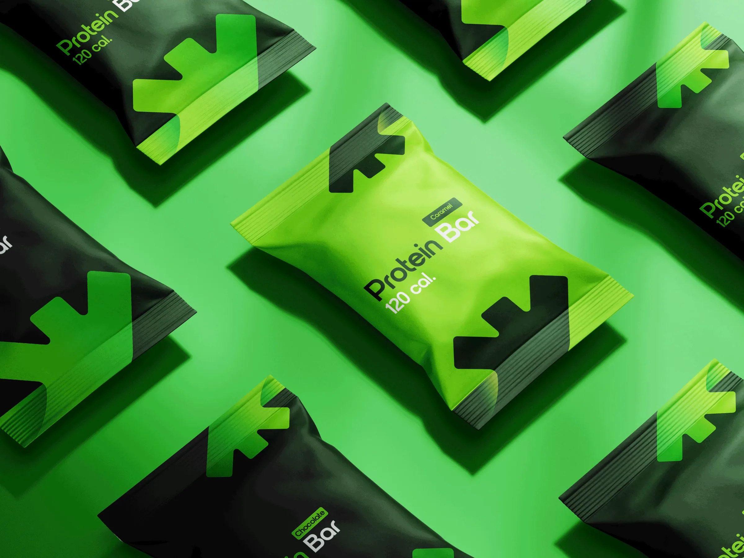
Brand identity
How the So’rah identity was made: from the brief and a hand sketch to a constructed mark, its meaning, its colours and type — and how the team checked it inside the app.
Opening frame of the brand presentation · poster of the pack film
ScrollBrand vocabulary
The words first
The second frame of the brand presentation is a type film: brand words in lime and dark green — solid, outlined and vertical — around a cookie. Here every word from its poster frame is set again as live type.
Live type stand-in for the film · set in IBM Plex Sans · hover a word
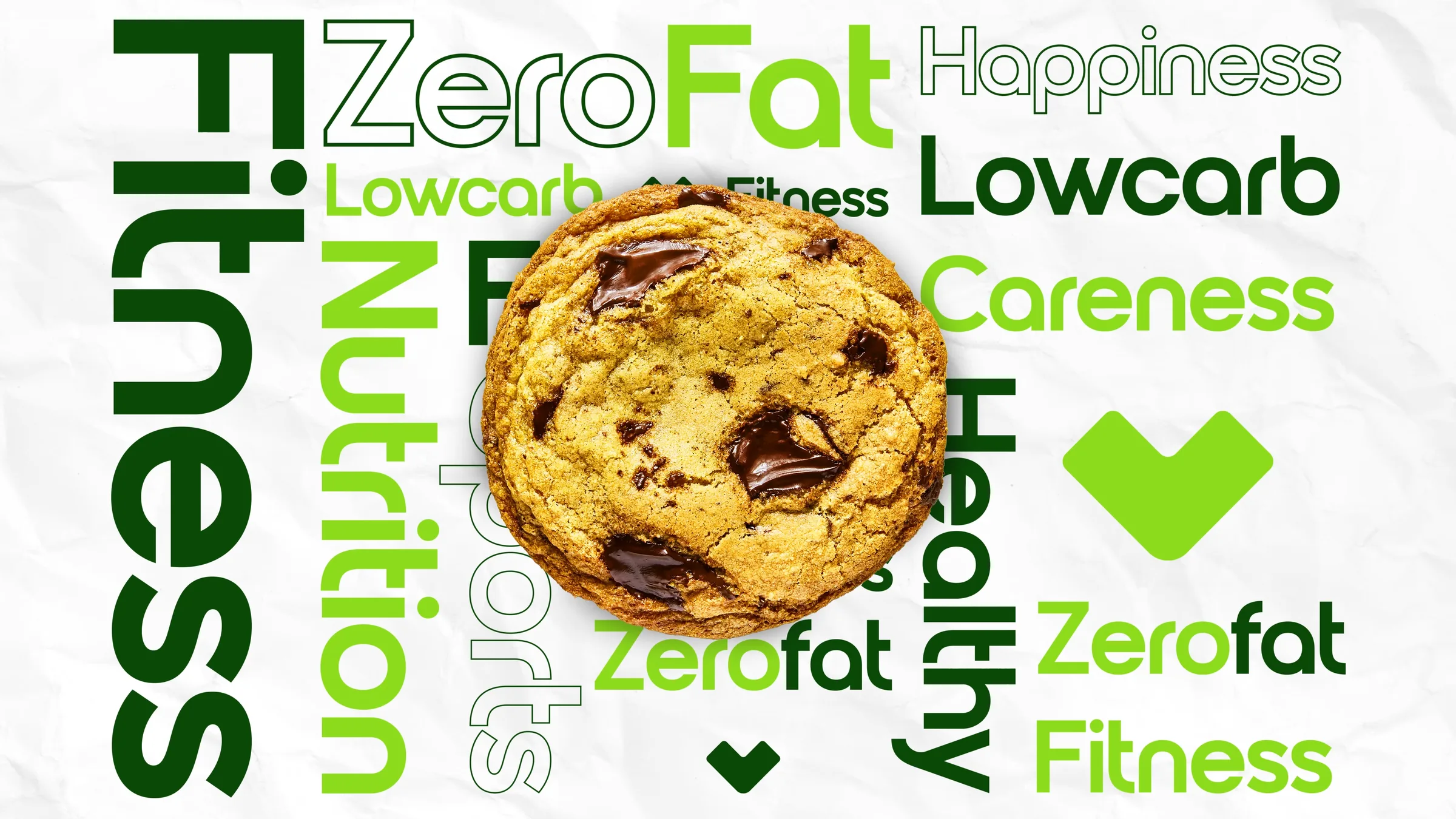
Every word in the frame (17)
Plus three brand glyphs: a large lime chevron/heart, a small dark-green one at the bottom, and a small one before the second “Fitness”.
The brief · who it is for
An app for organizing a healthy lifestyle in Saudi Arabia, designed for three main categories of people: those who want to lose weight, those who want to build athletic bodies, and those who suffer from chronic diseases and want to organize their meal schedules. It is also a marketplace that includes many healthy restaurants, creates meal plans, calculates calories, and devises strategies for users to help them achieve their goals.
The mark · on paper
It started by hand
The mark was first drawn with a marker on paper, next to a grey version of it crossed by construction lines. The next frames turn that drawing into geometry.

The mark · construction
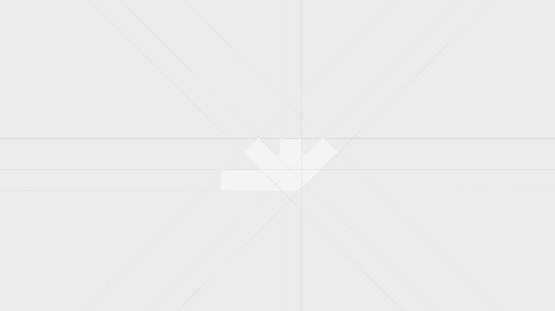
Built on 45° and a few shared lines
- Guide lines15 guides: horizontals at the top of the prongs, the top of the base bar and the baseline; verticals through the prongs; and near-45° diagonals.
- Anchor points22 handles on the corners of the mark.
- OutlineThe mark drawn as a pale outline over the grid.
- FillUnder it, the same mark in the brand gradient #8DDB1D → #00AA19.
The wordmark · construction
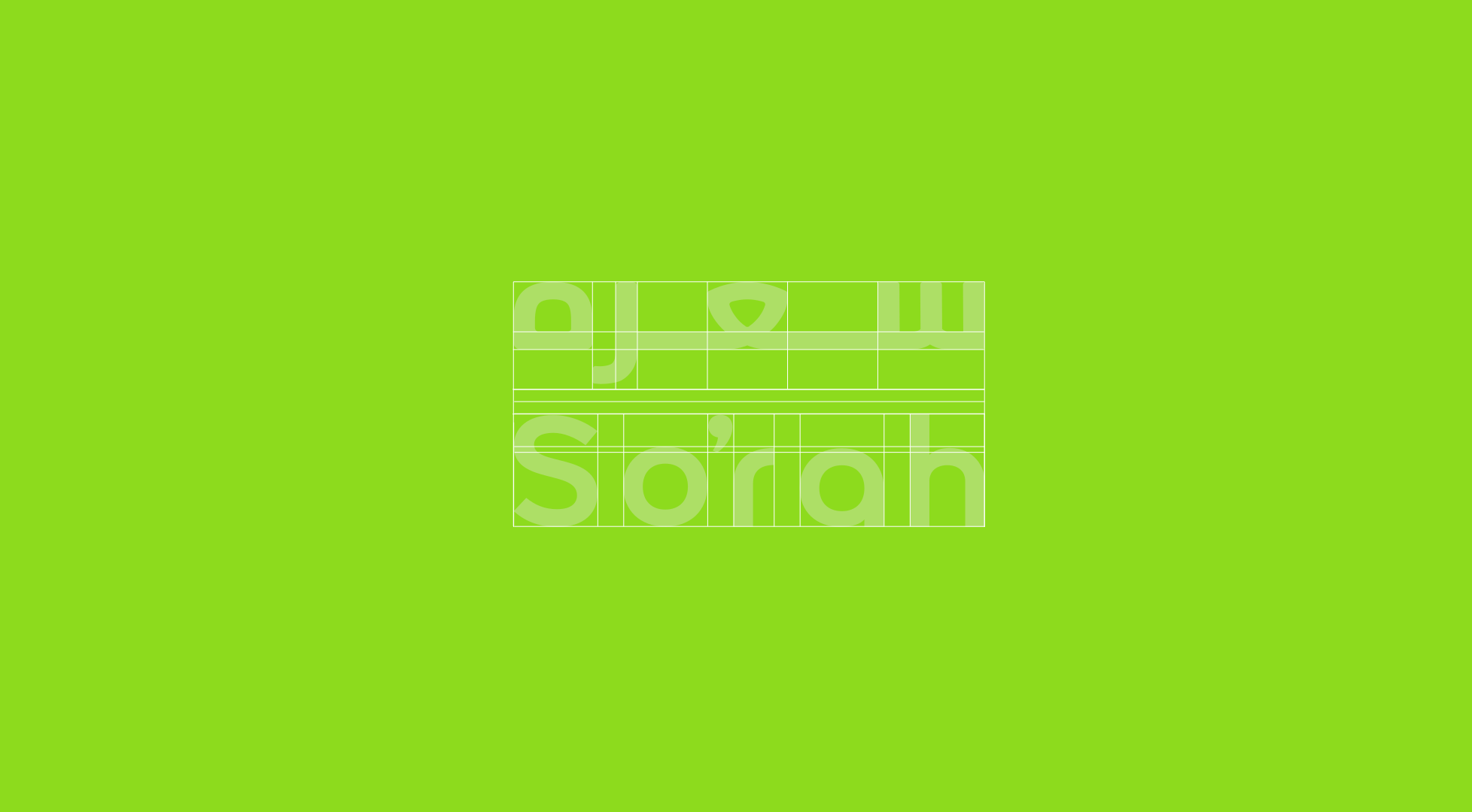
Two scripts, one width
Arabic سعره over Latin So’rah, drawn as one block: both are set to the same 625.9 px width inside one grid of 29 guide lines — horizontal bands for each line and verticals at the letter stems.
The mark · meaning
One mark, four readings
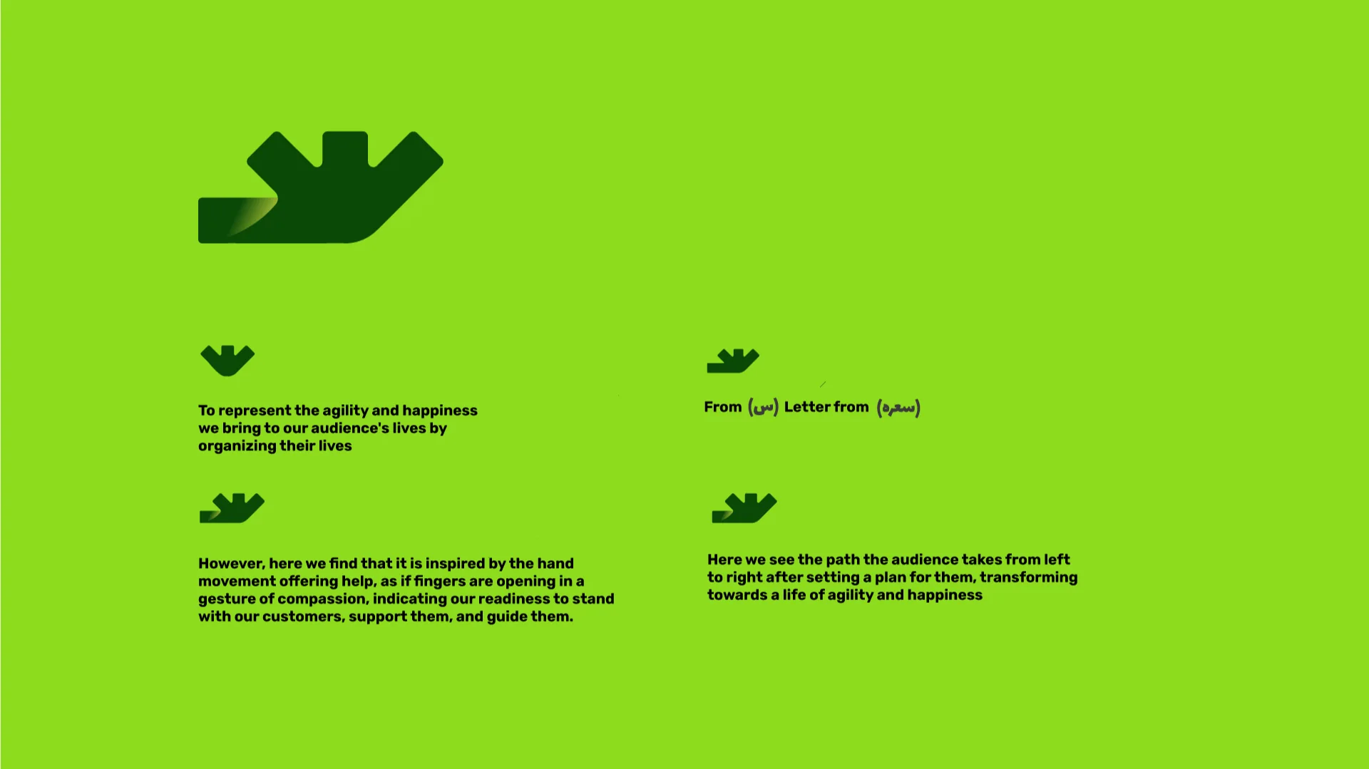
The brand presentation explains the mark in four short statements. Each one lights up the part of the mark it talks about.
-
01
To represent the agility and happiness we bring to our audience's lives by organizing their lives
-
02
From (س) Letter from (سعره)
-
03
However, here we find that it is inspired by the hand movement offering help, as if fingers are opening in a gesture of compassion, indicating our readiness to stand with our customers, support them, and guide them.
-
04
Here we see the path the audience takes from left to right after setting a plan for them, transforming towards a life of agility and happiness
The mark · stickers & pattern
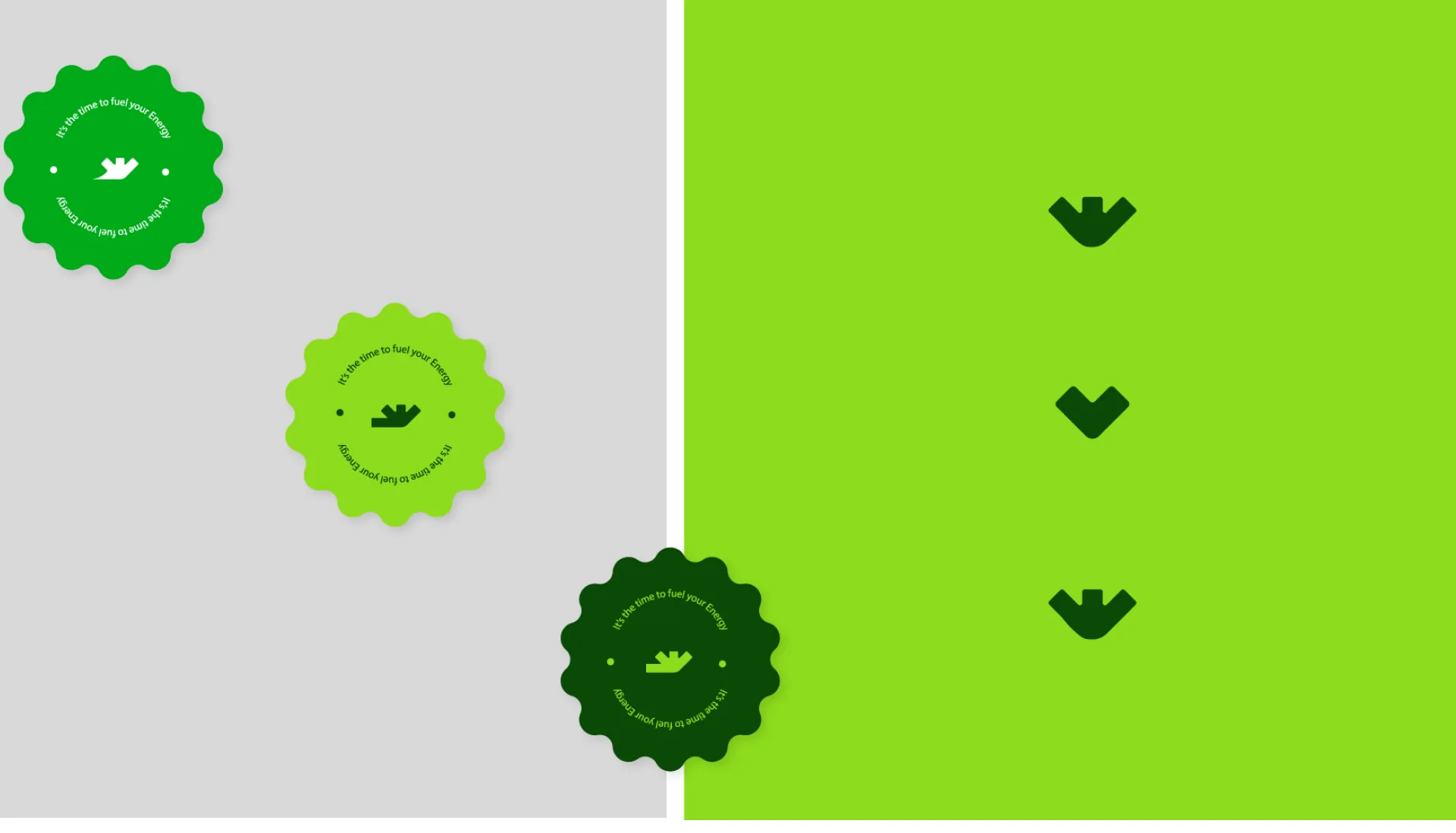
A sticker in three colourways
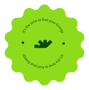
The mark sits in a scalloped sticker with “It’s the time to fuel your Energy” set around it — in green, lime and dark green.
- #00AA19 with white text and mark
- lime with dark-green text and mark
- #0B4907 with lime text and mark
Pattern — three dark-green glyphs from the mark, stacked on lime.
The logo · lockup
Mark, then wordmark
The primary horizontal lockup: the gradient mark on the left, the bilingual dark-green wordmark on the right — Arabic سعره above Latin So’rah, with a raised comma. The mark itself is two shapes: the main mark and a small folded corner at its lower left with its own gradient.
Logo files · clean SVG from the master lockup
-
Lockup — greenMark gradient #8DDB1D → #00AA19 (stop 0.68); wordmark #0B4907
-
 Lockup — dark greenMark #0B4907; fold #0B4907 → #F3FB4C (0.68); wordmark #0B4907
-
 Lockup — whiteMark #FFFFFF; fold #FFFFFF → #00AA19; wordmark #FFFFFF
-
 Mark — green#8DDB1D → #00AA19
-
 Mark — dark green#0B4907; fold #0B4907 → #F3FB4C
-
 Mark — white#FFFFFF; fold #FFFFFF → #00AA19
The logo · on colour
Each green gets its own logo
The presentation pairs each core colour with a logo version: the white lockup on green, the dark-green lockup on lime, and the gradient mark alone on dark green. Pick a panel or a background to try it.
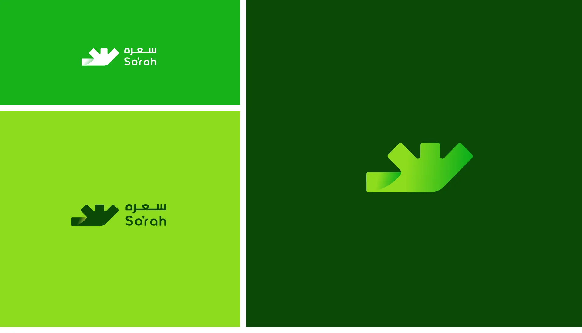
Colour
Three greens, two gradients
Dark green, lime and green, plus two soft gradient moods. Click a colour to copy it.
The two gradient tiles are bitmaps in the file (their colours are not defined as stops); shown here from those bitmaps.
Gradient builder
The exact stops used in the vector logo files
Pick a gradient, then drag on the preview to turn it. The stops stay as they are in the files.
linear-gradient(94deg, #8DDB1D 0%, #00AA19 68%)
Typography
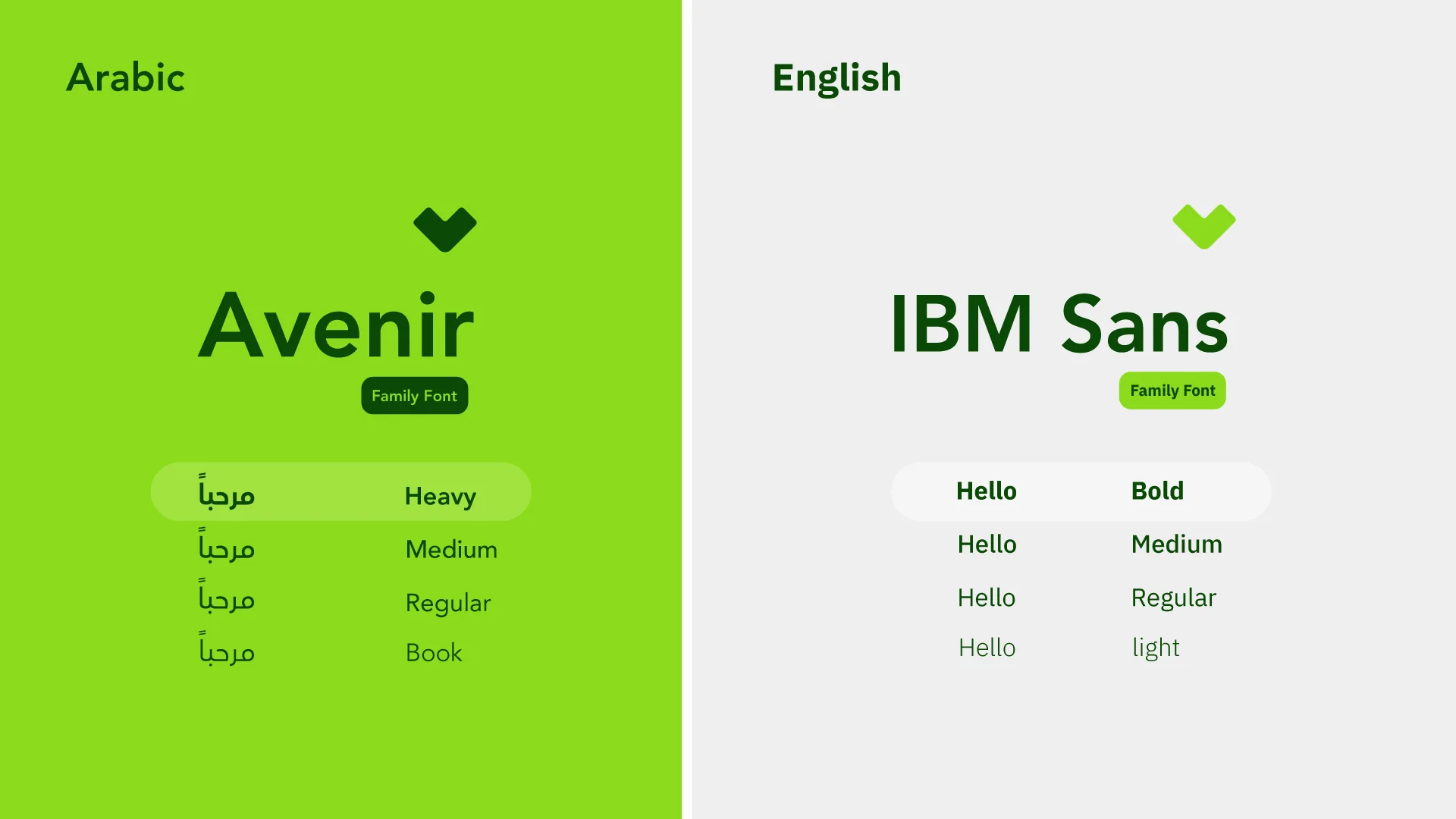
Two families, four weights each
An Arabic and an English family, each with four weights. Drag the weight, switch the script, or type your own word.
مرحباً
Hello
Arabic
Avenir
Family FontShown in IBM Plex Sans Arabic; brand face is Avenir Arabic.
English
IBM Plex Sans
Family FontLoaded here as a variable font: any weight from 100 to 700.
Branding QA
Then the brand went into the app
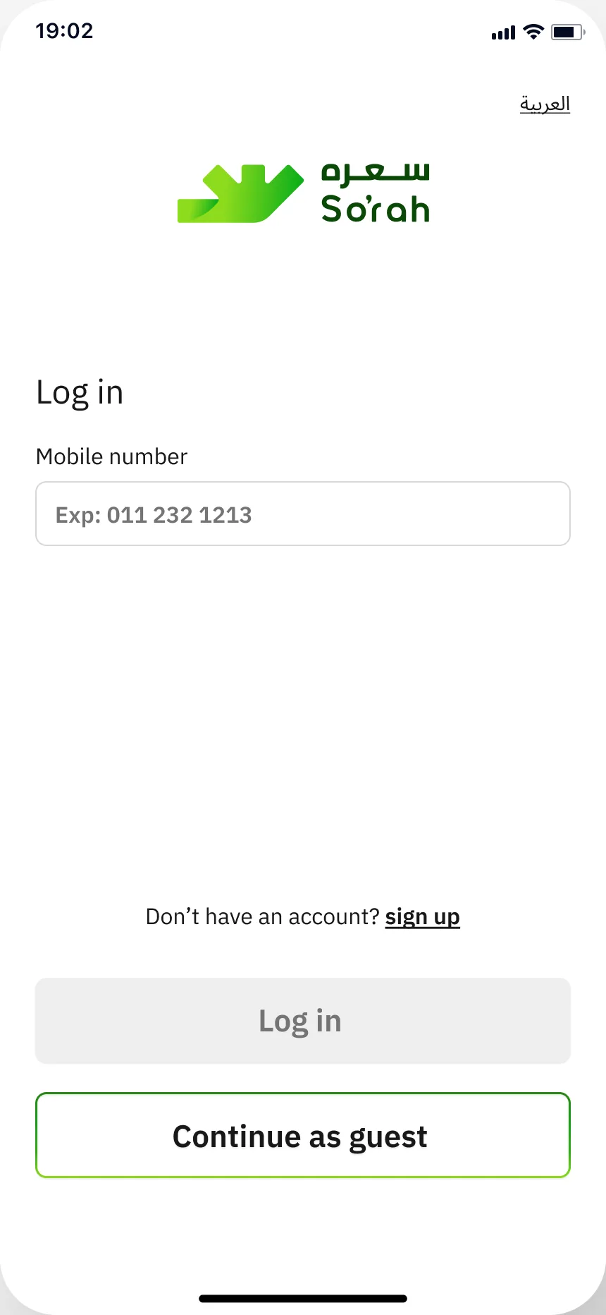
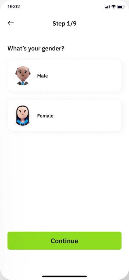
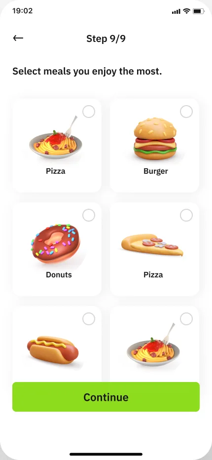
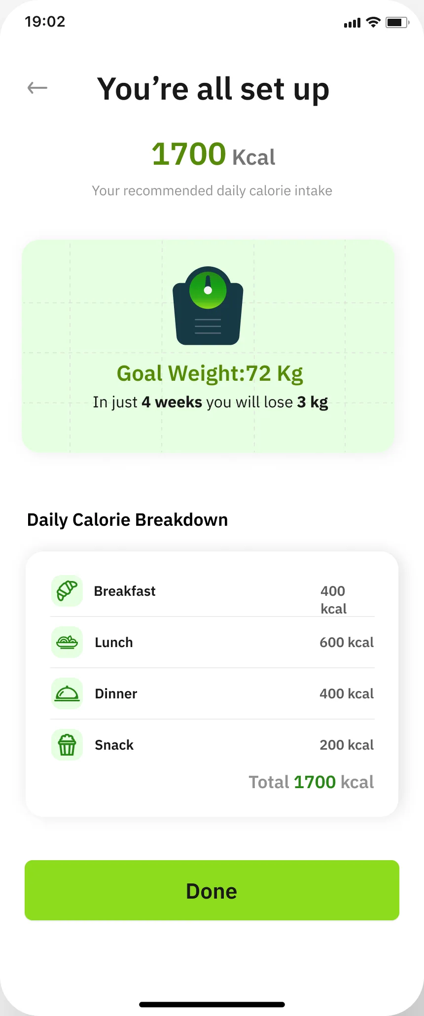
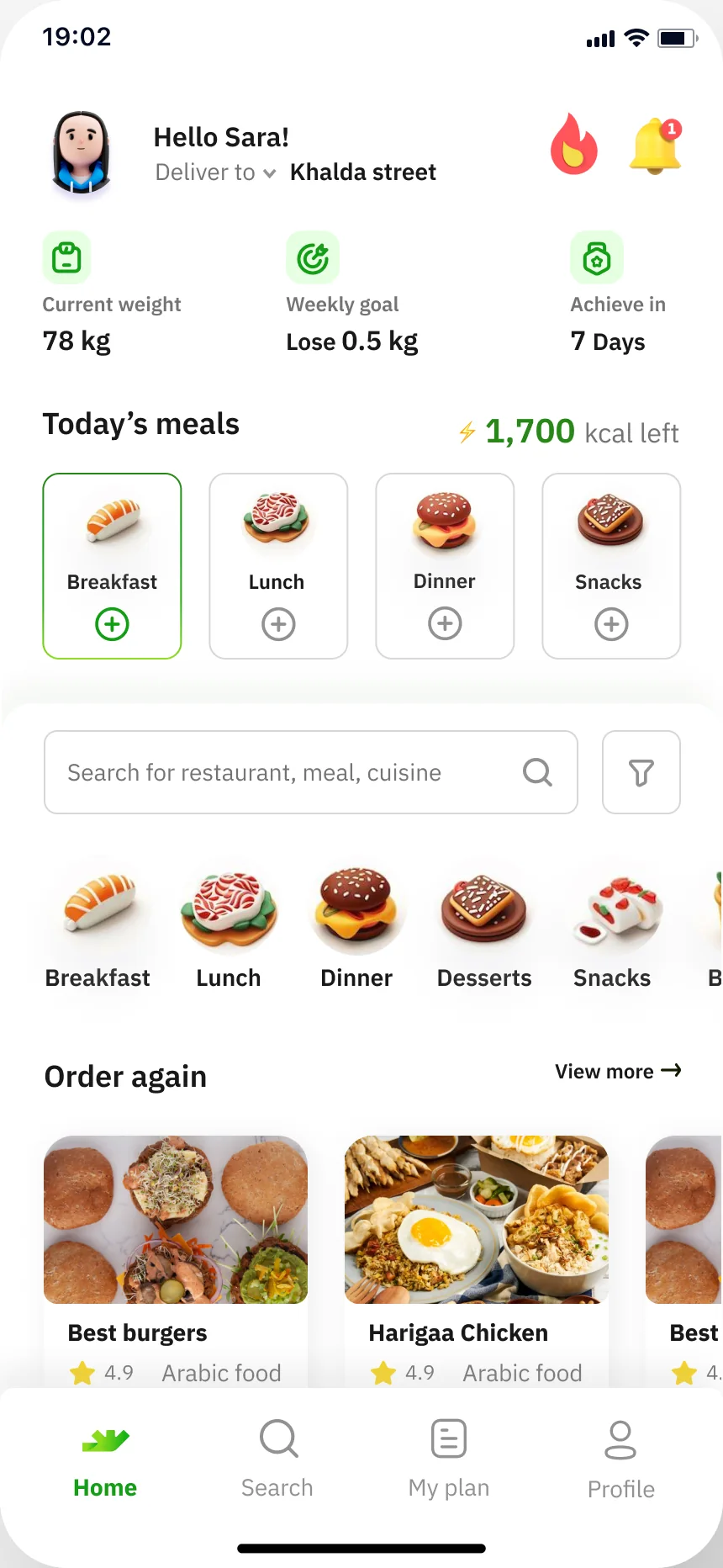
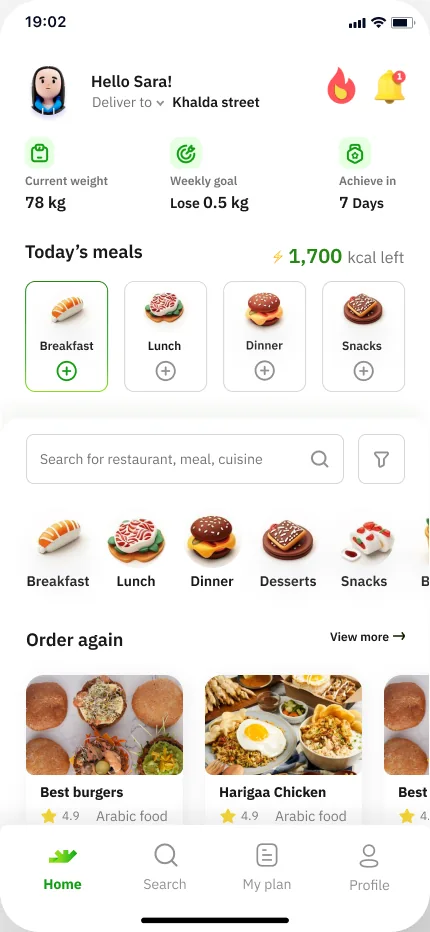
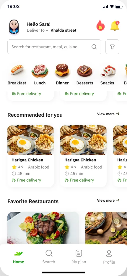
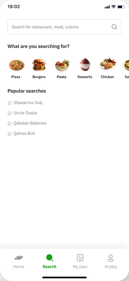
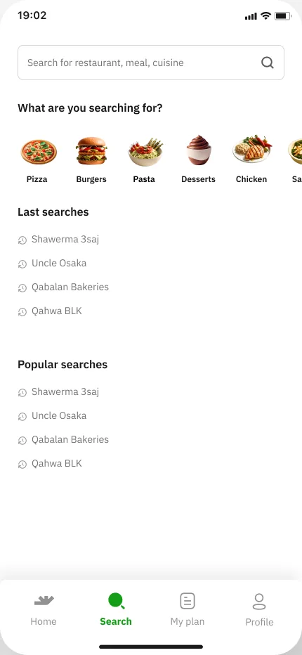
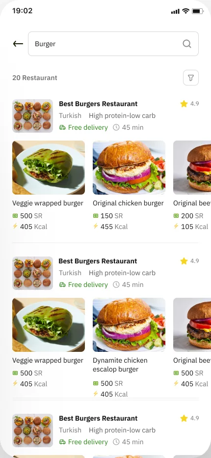
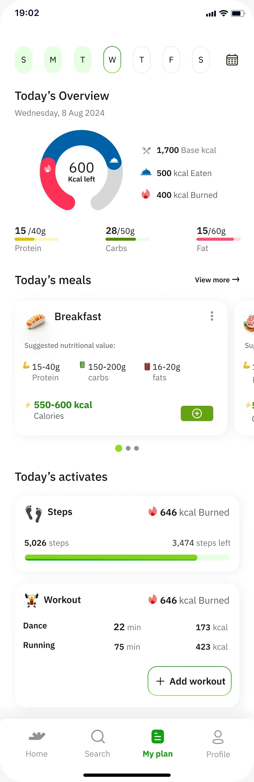
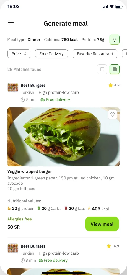
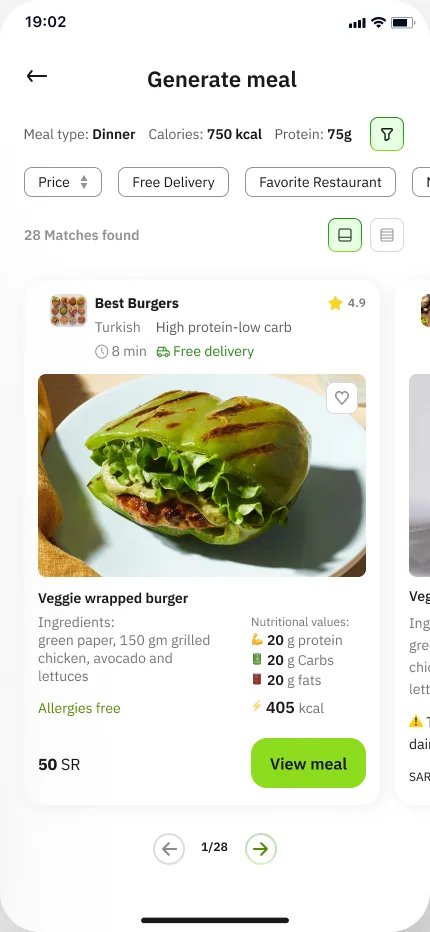
On a Branding QA page of the working file, the team laid out the app’s key screens in five rows — login & registration, home, search, plan and generate — to see the logo, the lime buttons and the green accents in use.
login & registration screens 9
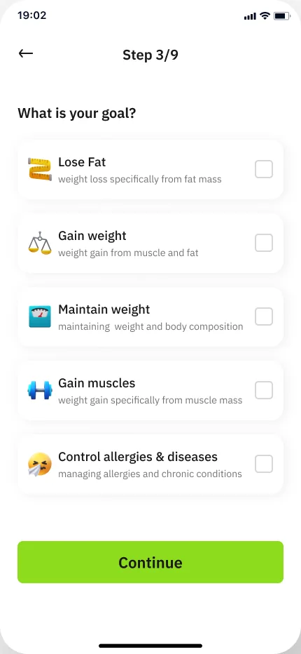
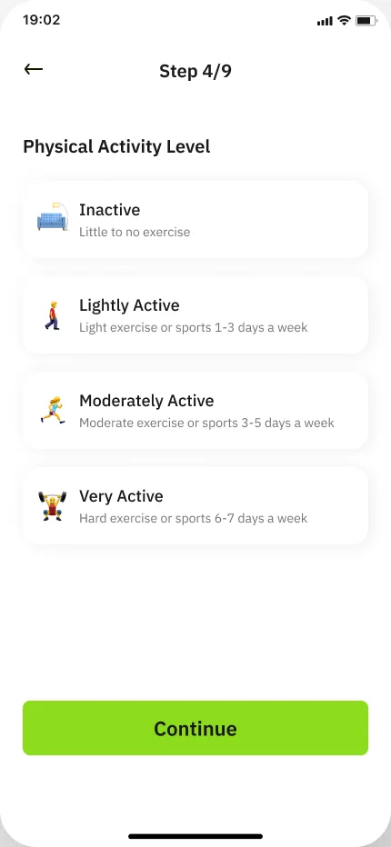
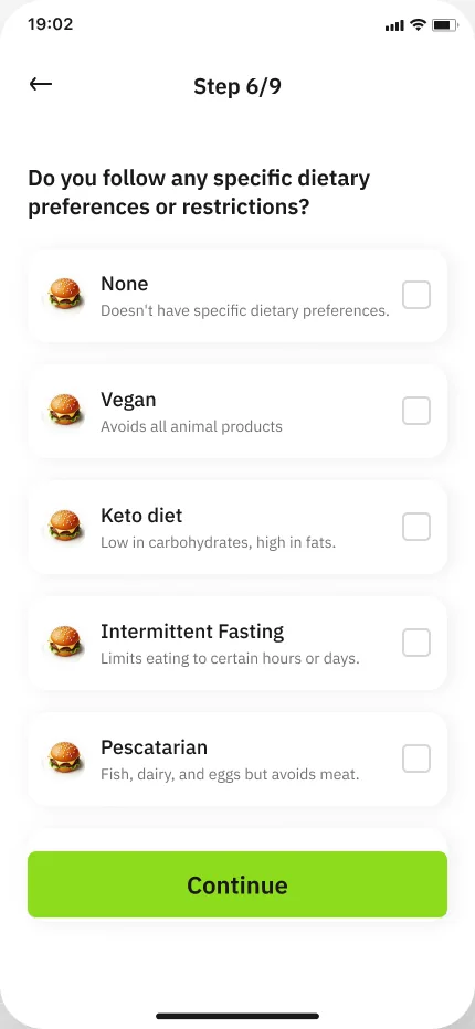
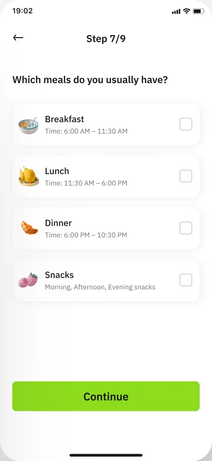
Home screen 4

Search screen 3
plan screens 1
Generate screen 2
Branding QA · the presentation copy
Same deck, two differences
The Branding QA page also keeps a copy of the brand presentation. Its 59 layers match the source presentation in name, position, size, image/video and text — with two differences.
-
01
The second “Gradient Color” swatch
QA copy: no logo. Presentation: the swatch carries the white So’rah lockup, added later.
-
02
The lockup’s mark
QA copy: the two mark shapes are loose vectors. Presentation: they are grouped as “Group 9”.
QA copy▢ Vector▢ VectorPresentation▾ Group 9▢ Vector▢ Vector