


Make one application feel simple at every lender.
Tanweel sends a single financing request to the banks and finance companies it works with. In 2024 the app, the website and the lenders' portal had grown apart. People could not find the calculator, thought they had to log in to see anything, and lost track of where they were. We had eight weeks to fix all three.
Tanweel is the first [[licensed digital financing broker]] in Saudi Arabia. One application reaches [[every lender.]] In 2024, people were [[giving up at the login screen.]]
Shopping for financing is slow by design.
Our desk research mapped how people in Saudi Arabia look for financing today, and why speed beats rate when they decide.
People borrow under pressure. With no time to compare, they take whatever is available and regret it later.
Source · Tanweel UX research report, 2024Four phases, one eight-week clock.
The Pixilated 4D loop. Each phase owns its weeks and ends with a gate the work has to pass before the next one starts.
Discover
- Desk research
- Competitor analysis
- Usability test of the live app
- Current-flow audit
Define
- User interviews
- Pain-point map
- Personas
- Journey map
Develop
- Information architecture
- Task flows with failure paths
- Mid-fidelity
- Moodboard
- Design system
Deliver
- High-fidelity UI
- Prototype
- Usability retest
- Promo video
Evolve
- Instant eligibility
- Open-banking income
- Live tracking
Five people tried it. All five got lost.
Three with existing loans, two planning to borrow. Thirty-minute moderated sessions on one task: get an offer from the calculator.
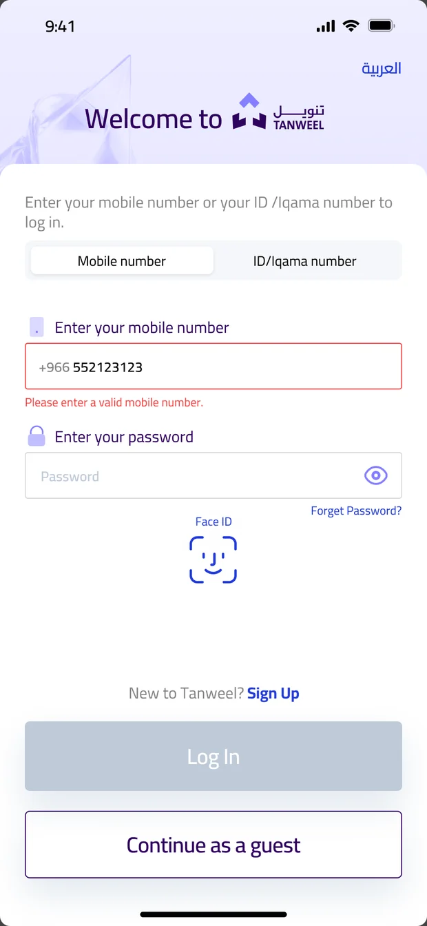
The best feature sat behind a login.
Every participant needed the calculator. None of them reached it, because the app asked who they were before it showed them anything.
What exists. What was missing.
Two local direct competitors, one regional, no international ones. Lenders selling direct were the indirect competition.
Tanweel had the app, the calculator and the lenders. It lacked an experience people could follow and any help understanding the products.
Six stages, six places people quit.
Every mark is the same chevron from Tanweel's logo. Stacked by stage, they trace how sure a borrower feels from first search to funds.
Two people, two very different screens.
Proto-personas built in week 3 from interviews and the baseline test.

The urgent borrower
Salaried · 25–45 · Phone, at night
The finance-entity officer
Bank or finance company · Desktop · Maker, Checker or AdminFour rules, every screen tested against them.
Show before you ask.
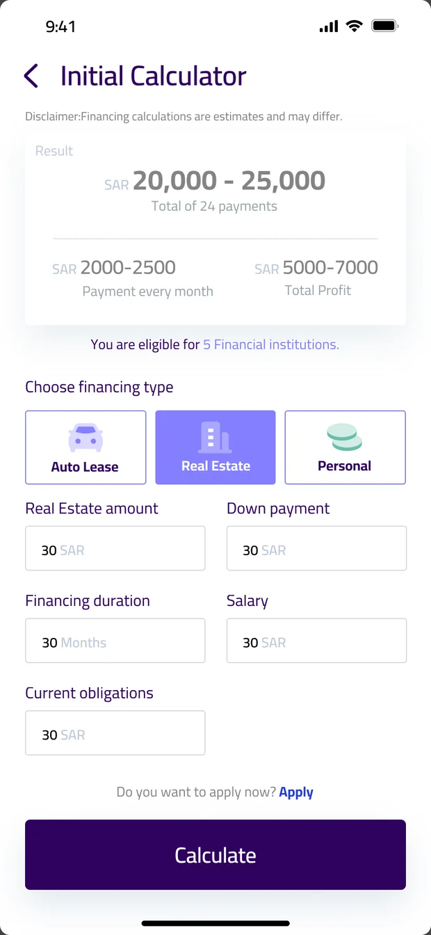
Value comes before registration. The calculator works as a guest.
You are always somewhere.
Every screen states where you are, which step, and how to go back.
Plain words beat finance words.
Murabaha, Ijara and auto lease are explained where they appear.
Status is a promise.
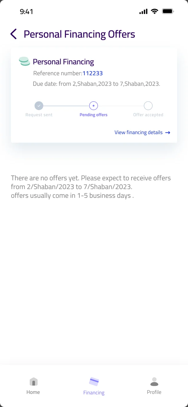
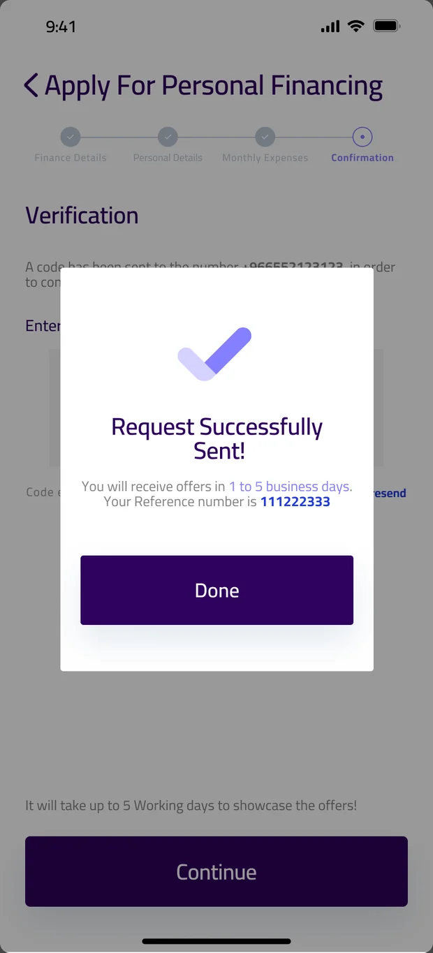
If something is pending, say how long and what happens next.
Fifteen menu entries. Six sections.
On the finance-entity portal, sub-pages left the sidebar and became tabs inside their section.
Offers
Calculator first. Login second.
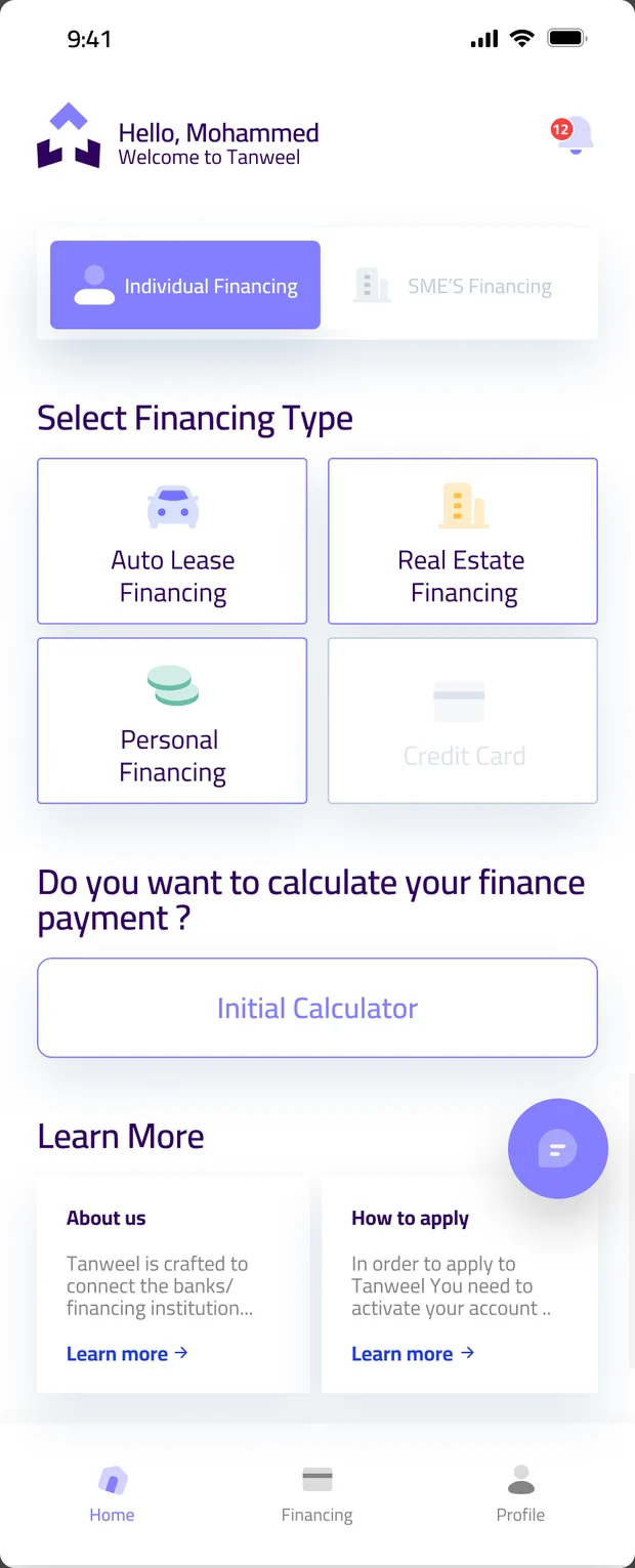
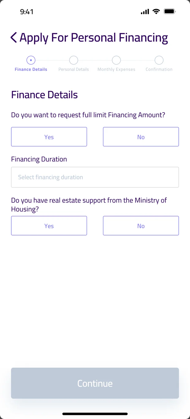
The guest calculator leads, then a four-step application with Simah consent in context and a stated wait time. Screens are from the shipped Tanweel app.
Their brand, rebuilt as a system.
We kept Tanweel's identity and turned it into tokens, type and components shared by iOS, Android and the web.
One status language
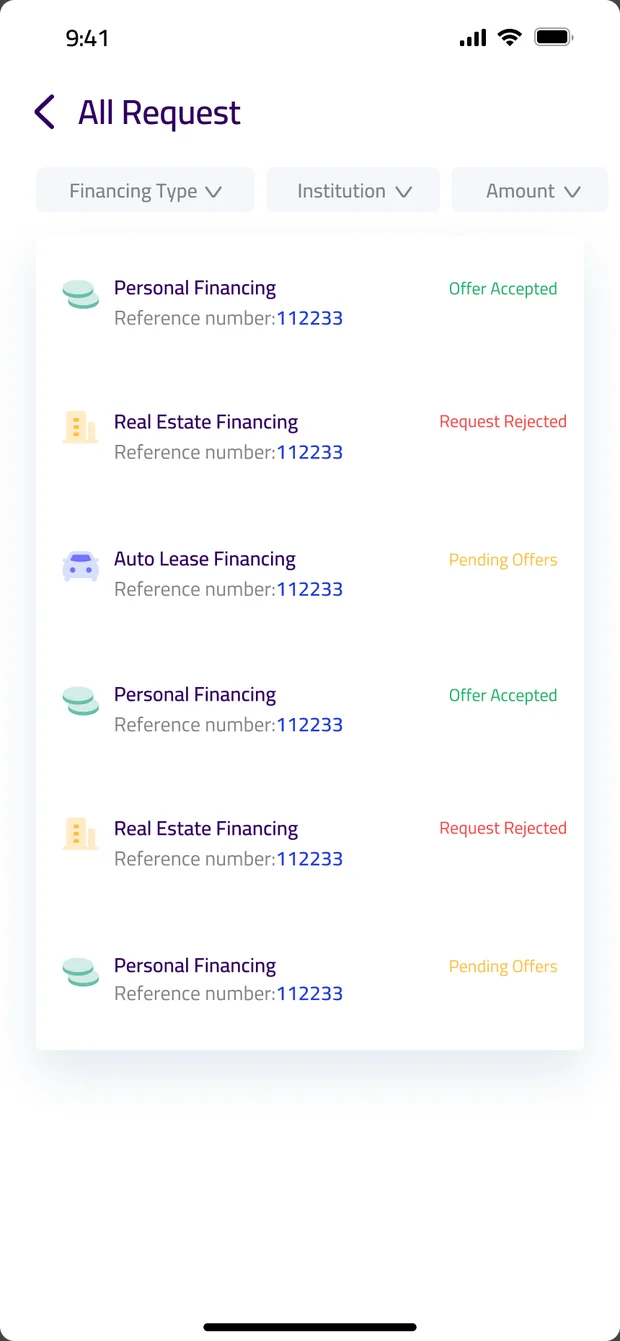
More than fifteen lender states, five colours, shared by customers and banks.
Built around the calculator.
Financing types as clear tiles, the calculator one tap from home, and a learn-more row for first-timers.
A lender's whole day on one screen.
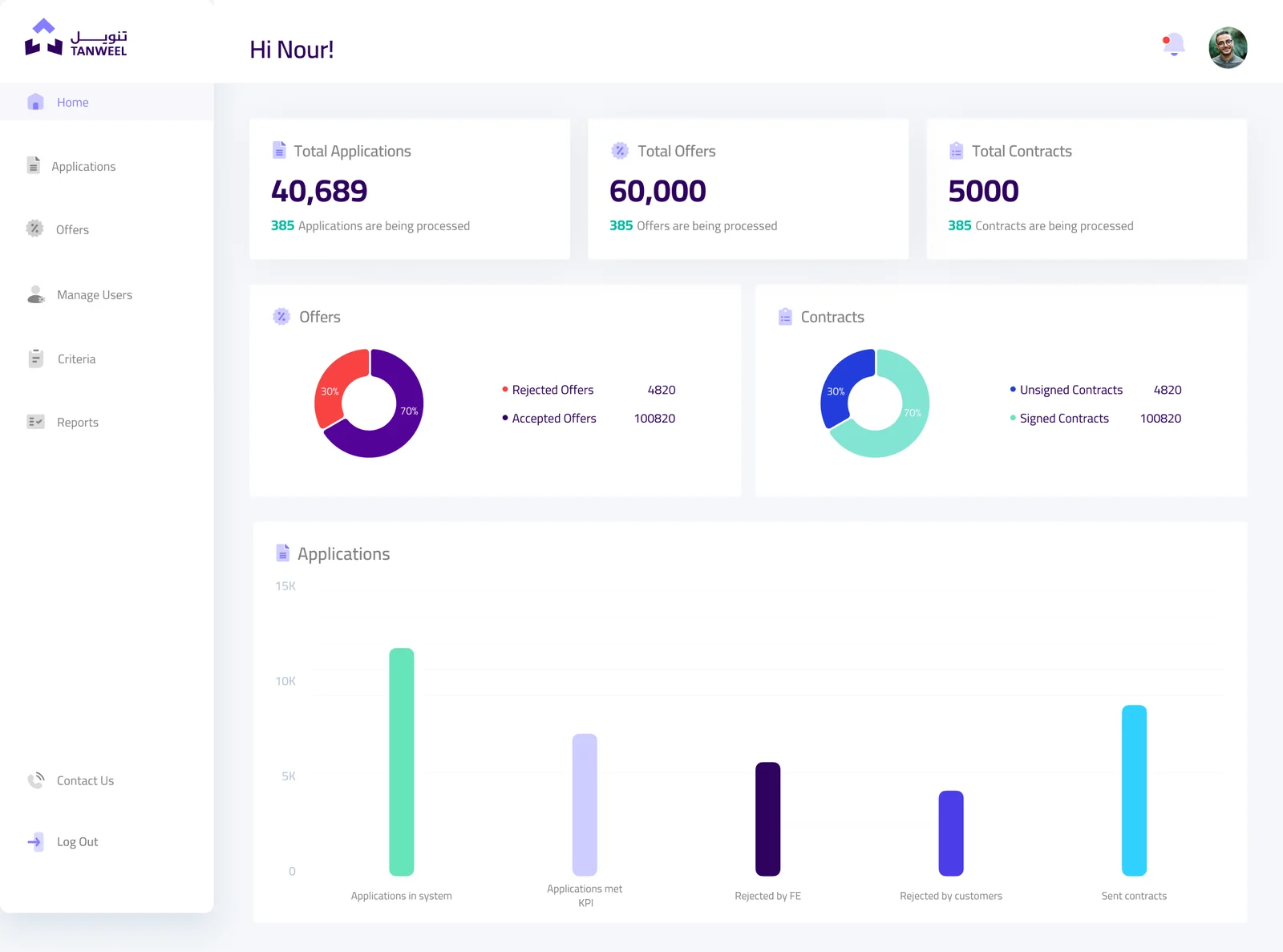
Applications, offers and contracts at a glance, with actions in the row and roles for Maker, Checker, Admin and Integrated FE.
Built for ease, proven by use.
Week 8 closed with a second usability test on the redesigned flows. Each card compares a task with the 2024 baseline.
What Tanweel looks like in 2027.
The 2024 work fixed findability and structure. These Pixilated proposals remove the remaining waiting and paperwork.
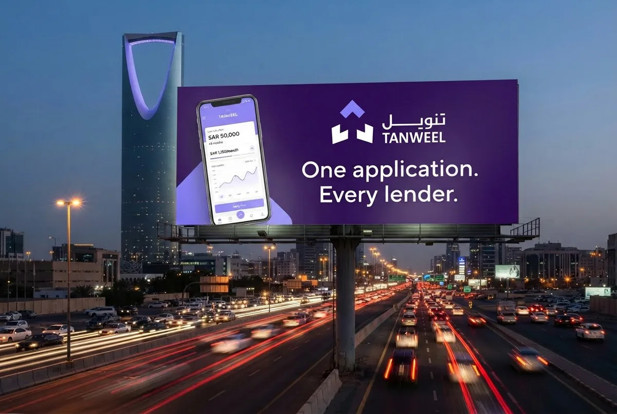
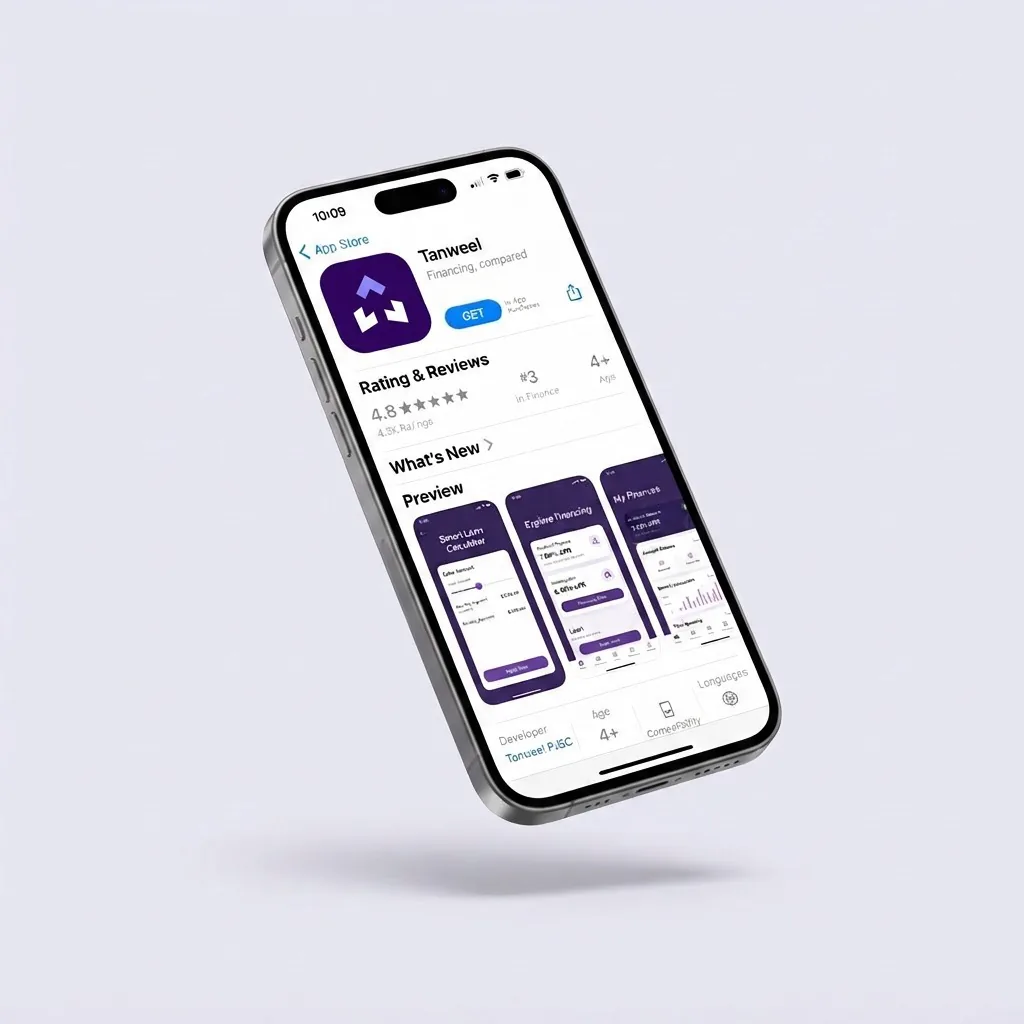
Tanweel, out in Riyadh.
Concept mockups to produce for the website version of this case study.

Four roles, eleven deliverables.
Built by the Pixilated UX team over eight weeks, from the first usability test to the promo video.