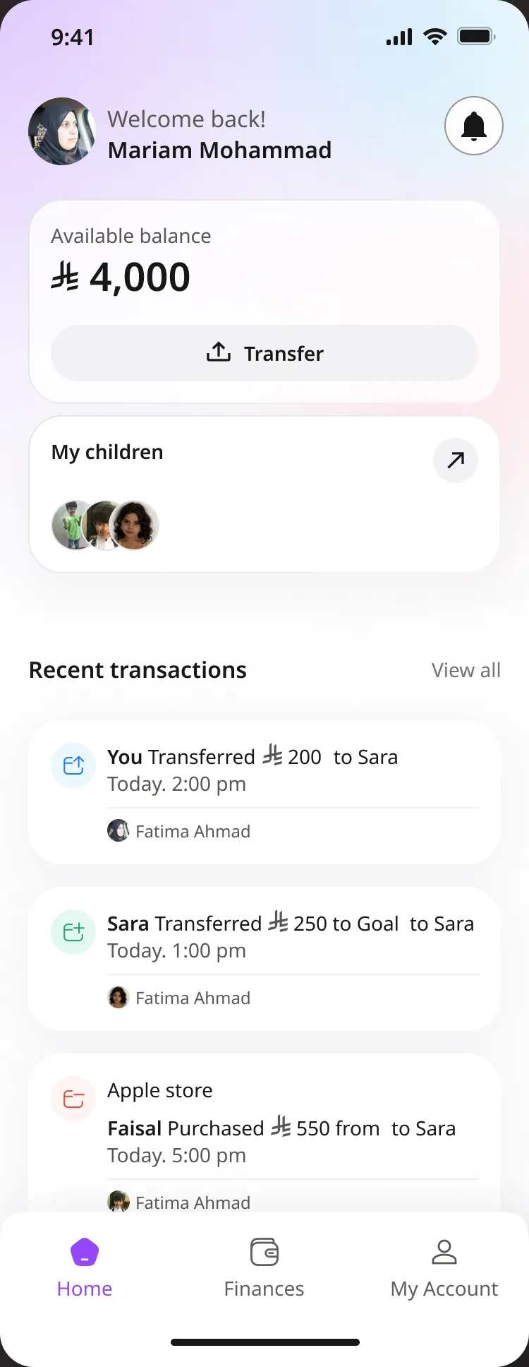
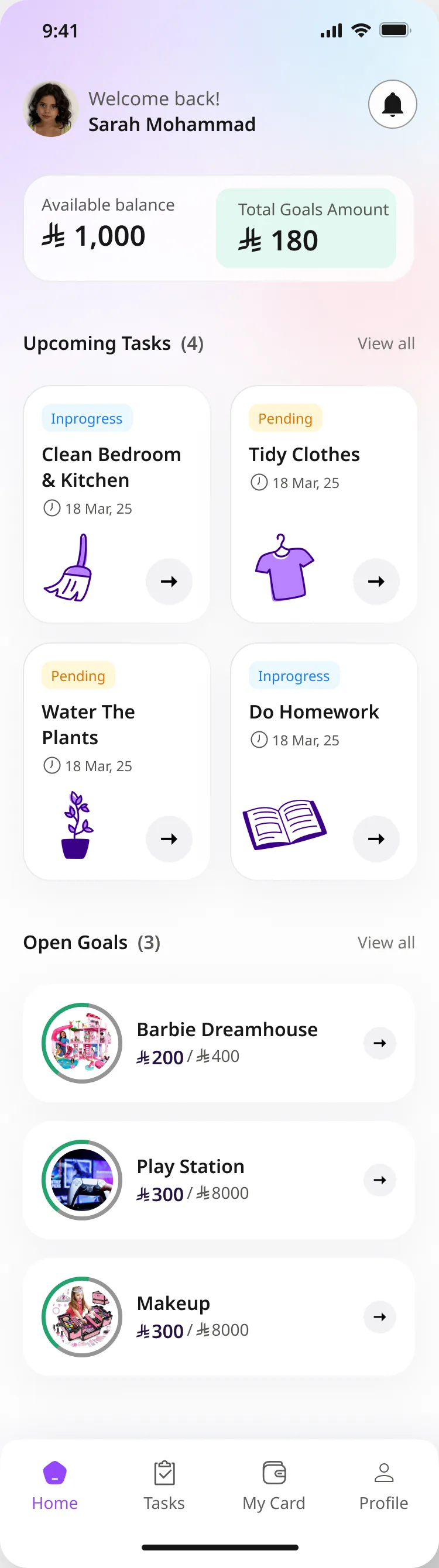
 Audience 1
Guardians
Parents who want a safe, educational way to manage their child's money.
The junior app, lifted off a kid's desk.
The first version already existed. The brief was to find what got in the way: identify the UX issues, propose fixes people could act on, and make the flows consistent and accessible.
Audience 1
Parents who want a safe, educational way to manage their child's money.
 Audience 2
Children and teens learning responsibility and keeping track of their spending.
What the product does
Parents set spending limits, approve transactions and automate allowances.
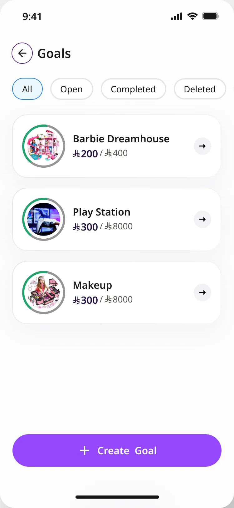
Kids create goals and track their progress toward them.
Personalised prepaid cards with spending insights.
Challenges and rewards for good money habits.
Parents and kids hear about every transaction as it happens.
Money moves between family members and friends.
Empathise, define, ideate, prototype, test. Below, the same work laid out on the double diamond: where the team looked wide, and where it narrowed down.
Before designing anything, the team went through MVP 1 screen by screen on an iPhone 13 mini, wrote down every problem with a fix beside it, and measured the app against the market.
A heuristic review of usability: content, information architecture and missing features, screen by screen.
Visual, interaction and accessibility review, plus a check of the app against the brand's colours, type and logo.
Every issue is rated so the team fixes the blockers first. Pick a level:
Youth-money apps reviewed and scored against a 30-feature checklist, one point per feature.
One map per app, built from the audit: four tabs each, with every section's contents listed.
The chore loop end to end: a guardian creates a task, a junior completes it. The audit found the first flow missing.
Benchmark scores, out of 30
The finding slides were copied into the design file and labelled as the redesign moved: Done, or deleted along with the feature they described. Each dot below is one finding. Select a dot to read it.
Statuses come from the labels placed over each finding slide in the Zod design file. The 10 findings without a label are later UI-audit items: the request-money popup, the transaction and spending screens, and the three branding checks.
The original MVP screen sits on the left, the redesign on the right. Drag across the phone to compare, and scroll inside it to see the full length. The findings each screen answers are listed beside it.
The UI audit found off-brand colours, the wrong typeface and inconsistent links. The answer was a token system in Figma variables: brand values feed aliases, aliases feed the components.
Raw colour ramps
Theme roles: primary, secondary, success, error…
Mappings from roles to use, such as text
Data-viz colours
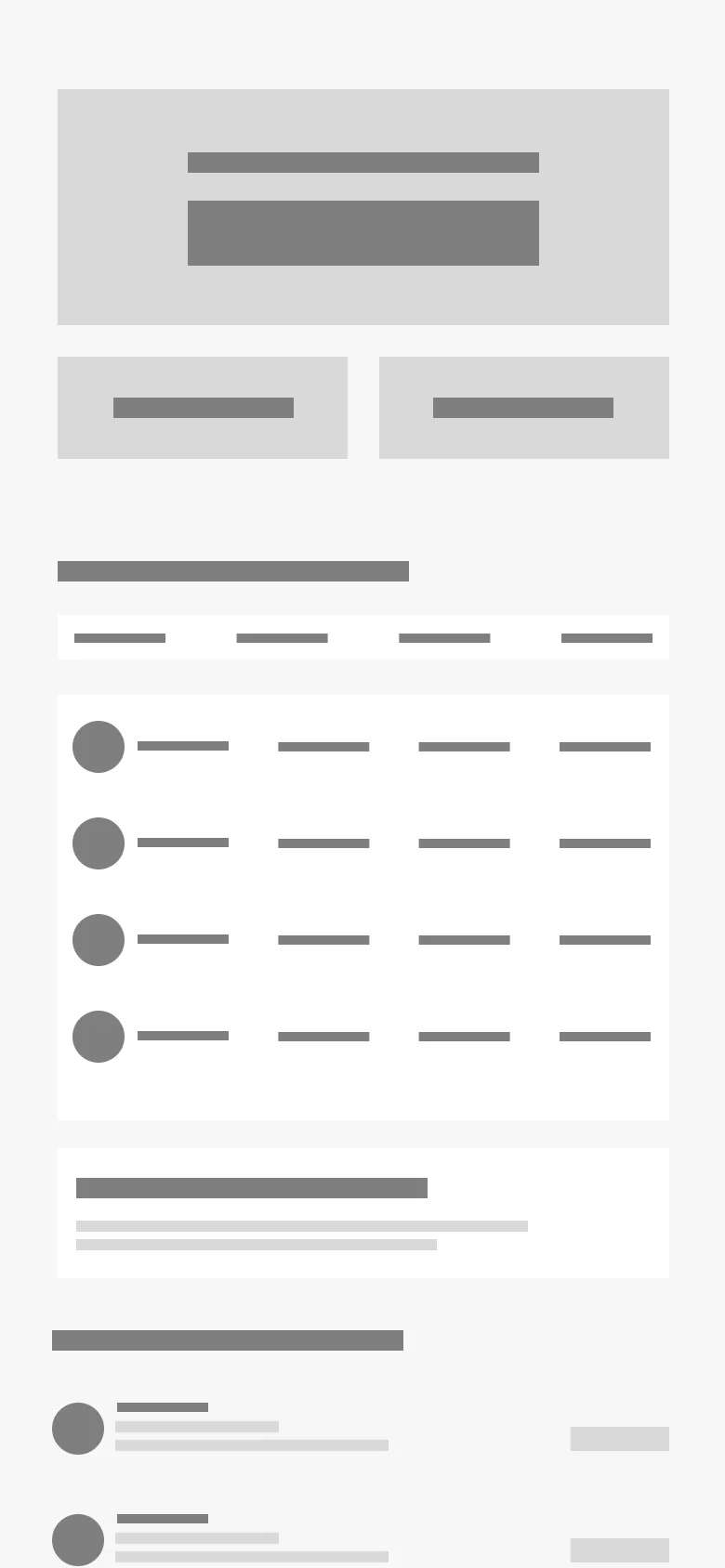
The guardian home was rebuilt in greyscale first, section by section, so the order of things could be argued about before any colour went on. Hover a section to find it on the wireframe.

Information architecture
Original maps: ·
Original diagrams: ·
Drag sideways. Hover a long screen to scroll it.
App Store set · Arabic
It starts on a kid's desk. Scroll on to follow one chore, from the task list to the savings goal.
Scroll to move through the junior app, one step at a time.