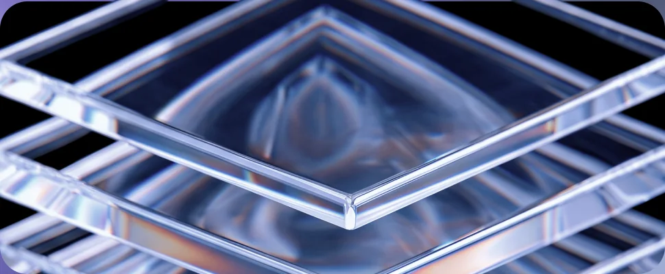
 Glassmorphism
Our brand uses glass texture to symbolize simplicity and ease, reflecting a smooth, intuitive experience.
Chapter 03
Scroll
The brand is built on a flexible and scalable architecture, rooted in a strong master identity that serves as both the visual and strategic foundation. In the current phase, this identity is being solidified through the core logo and patterns to establish recognition and anchor the brand around the value of precision in measurement.
The icon will be changed only within the designated area, in alignment with the sub-brand’s domain.Refers to: safe area (centre square)
Tampering with this area is strictly prohibited in order to preserve the integrity of the logo structure.Refers to: the outer logo shape
We conducted a questionnaire with the audience to understand what comes to their minds when they hear the name “Magas.” This helped us get closer to a clear insight that we can build our mind map on. The results were as follows:
Answers with an arrow also appear in the Mind Map Story. Select one to find it.
Hover or select a box to light up its branch. Arrow keys move between boxes, Esc clears.
Select a word to find where it sits in the mind map.
A brand moodboard is basically the emotional blueprint of a brand before anything gets designed.
It’s not decoration—it’s a strategic tool that translates abstract positioning into a tangible visual + sensory direction.
Select an image to view it full size.
GlassmorphismOur brand uses glass texture to symbolize simplicity and ease, reflecting a smooth, intuitive experience.
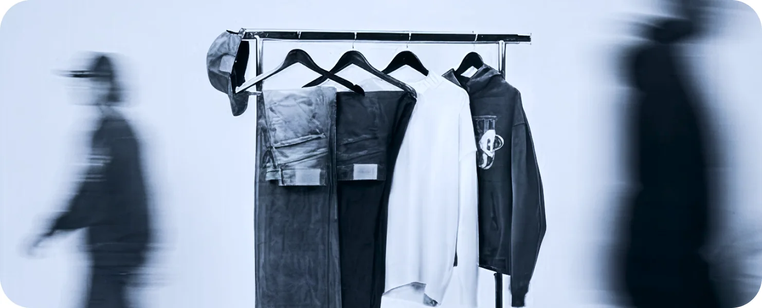 Motion Blurs
Motion blur is a key brand texture, emphasizing primary visuals while subtly blurring surroundings. This creates a clear hierarchy, directing focused attention.
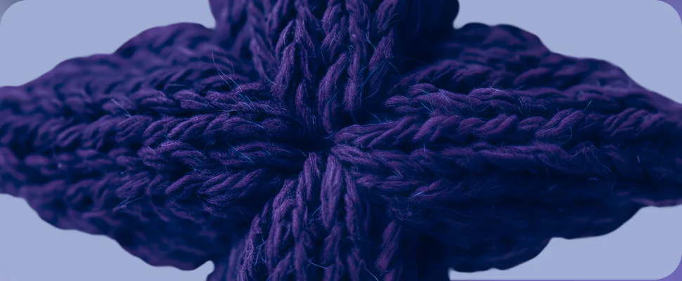 Cloth
Fabric is a key texture, reflecting fashion and materials. It makes visuals feel real and connected.
Select a texture to see it full-bleed.