Archives
Description
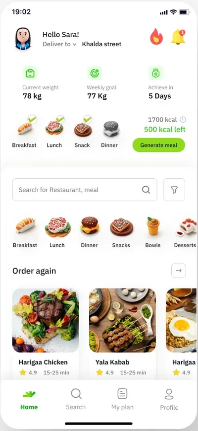
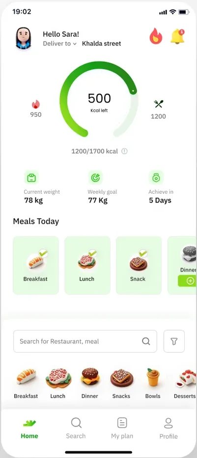
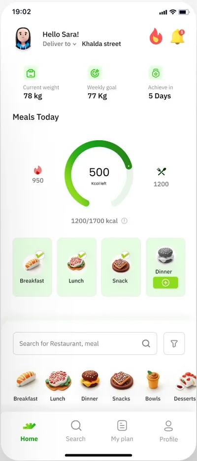
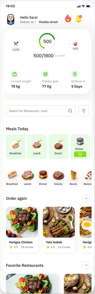
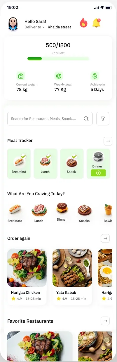
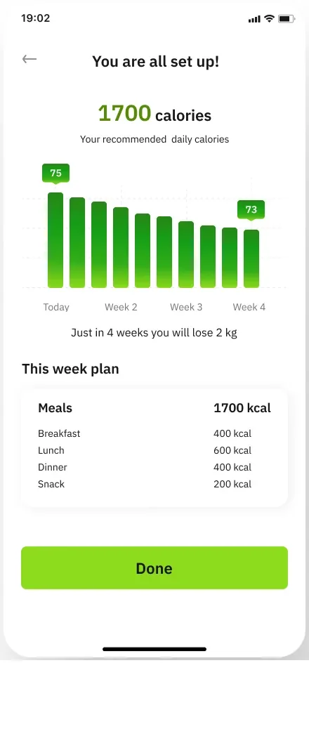
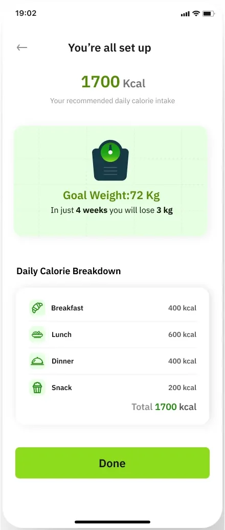
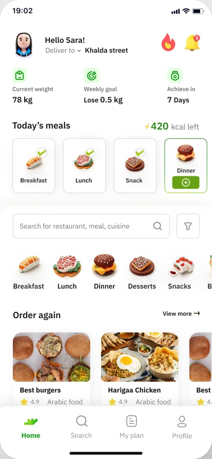
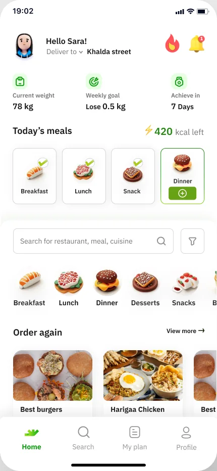
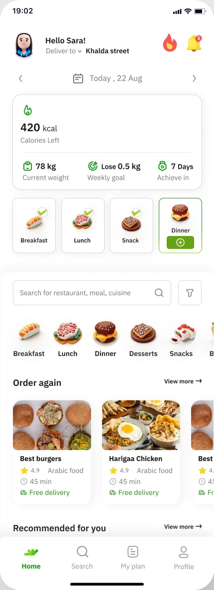
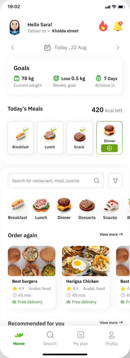
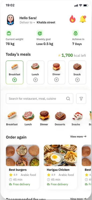
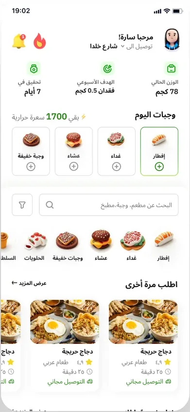
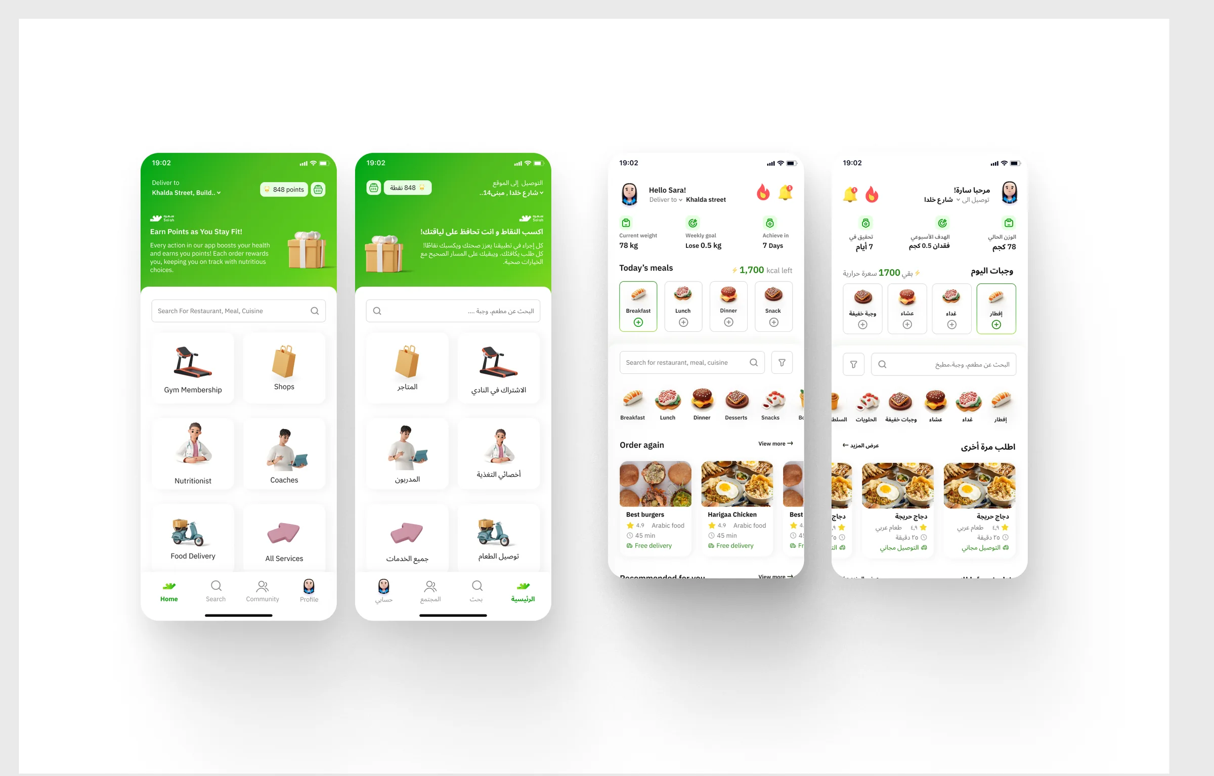
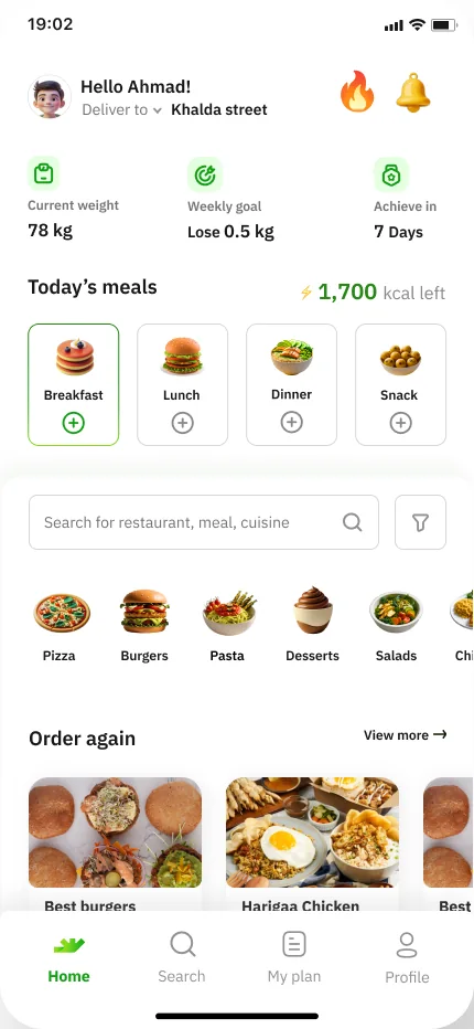
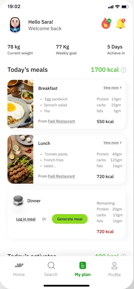
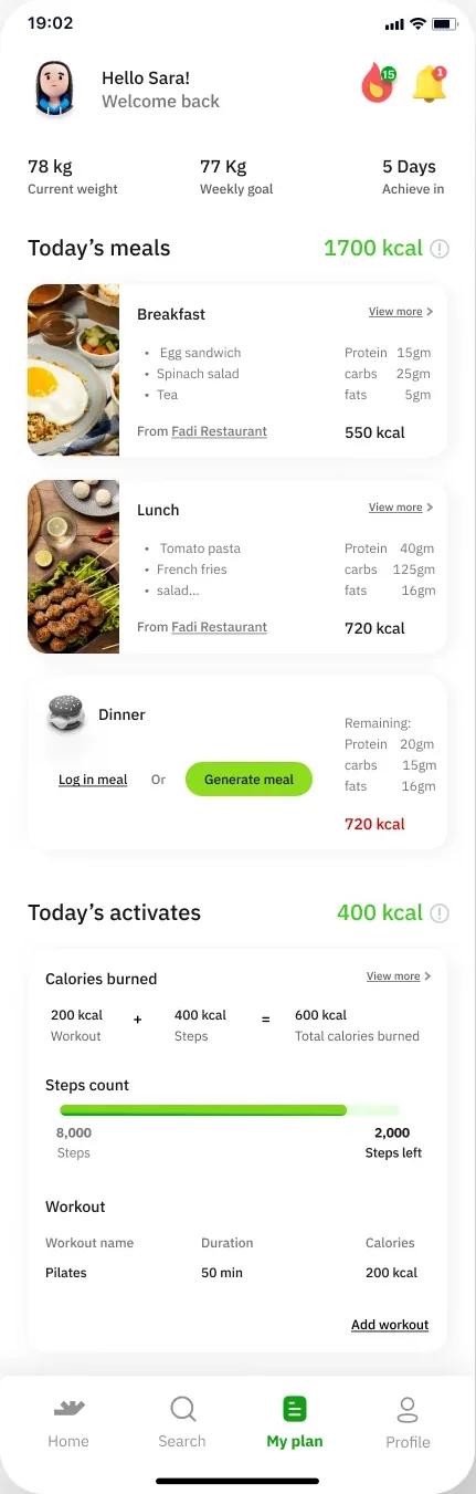
This is user’s plan screen
Users get to set their meals count and the app will automatically count the calories and nutritional values amount to every meal.
When users order a meal to a meal type the order will be saved and logged in the meal type card
Problem
UI problem 1: In the dinner card users haven’t yet ordered or logged in a meal.
There are too many clickable elements: the card, button and hyperlink.
How can we reduce it without changing the content?
UI problem 2: how can we design the goal tracker above in more of a statistical way?
Point at a problem to see where it sits on the screen.
 goal tracker
card
button
hyper link
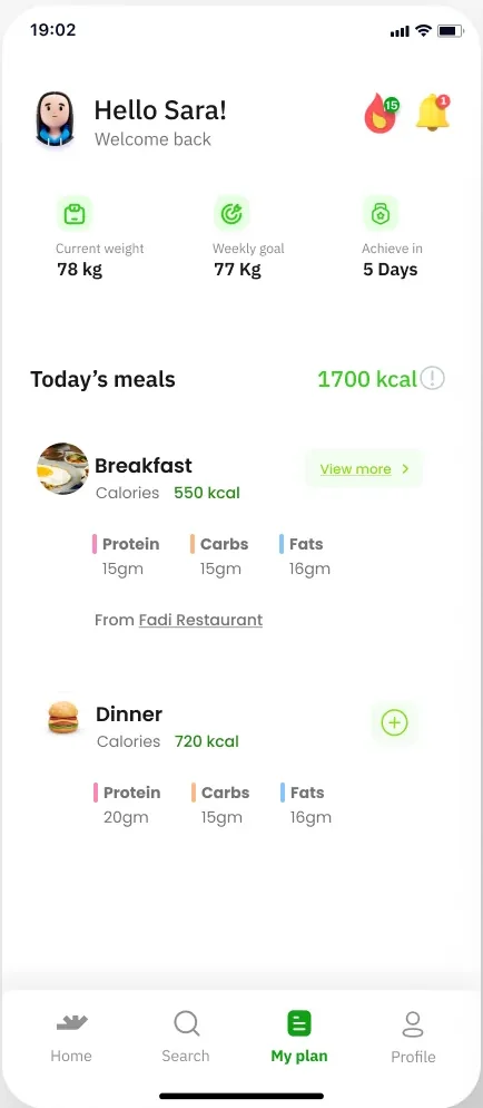
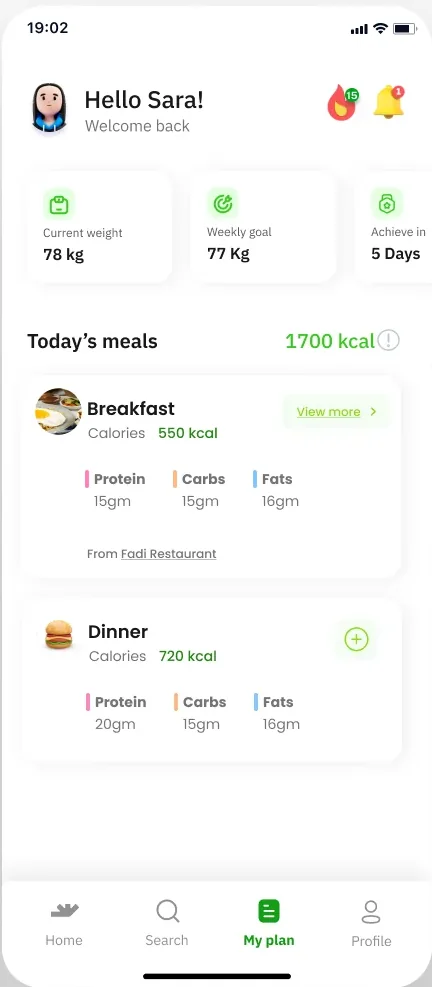
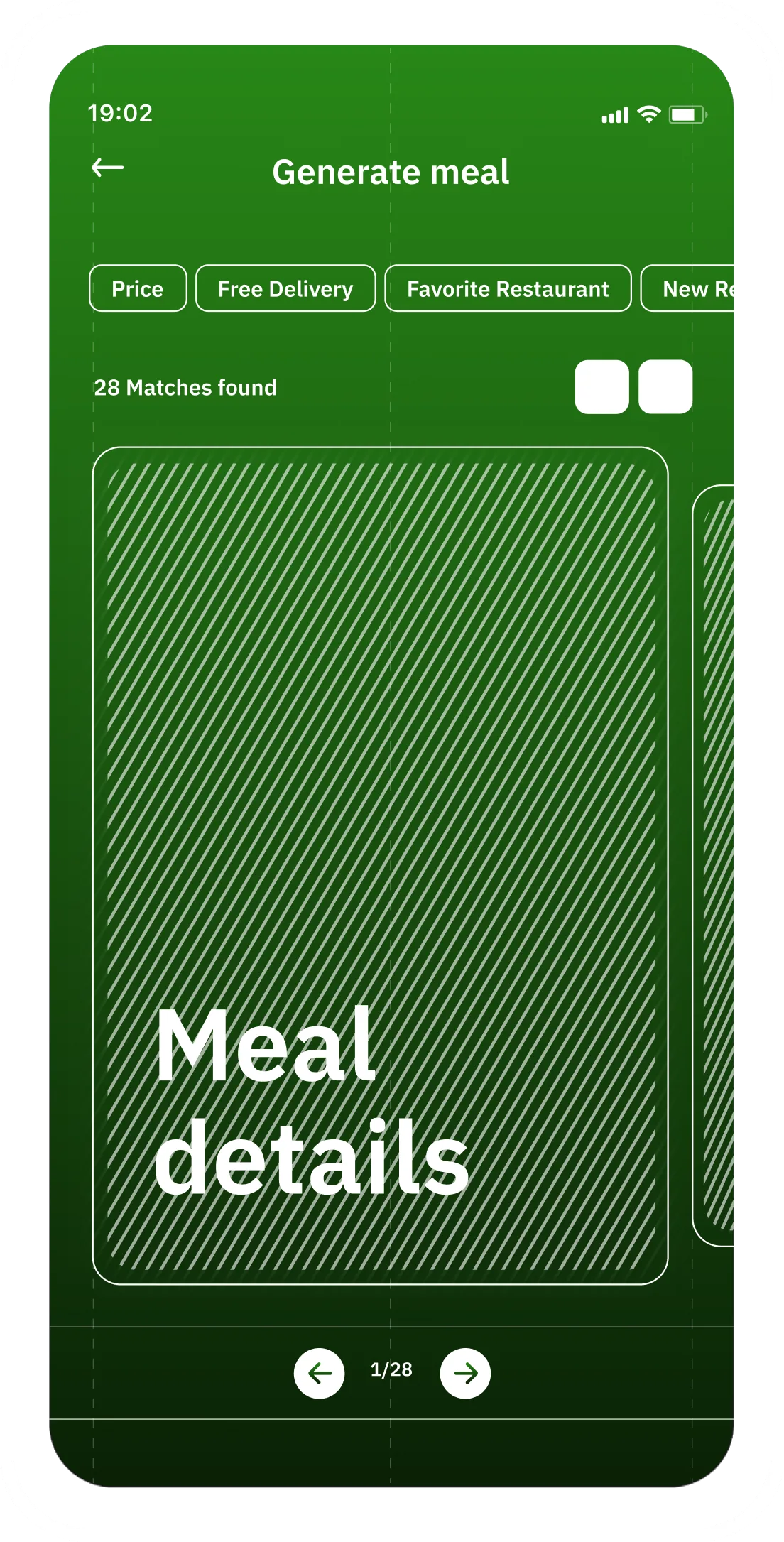
If user wants to view what the breakfast contents were, they can click on view more. Either bottom sheet will appear to showcase details or new page opens.